This week our lab module focused on critiquing a map using the map design principles established by Edward Tufte and the principles for design created by British Cartographic Society. The following maps were evaluated for quality based on these principles. Each map is accompanied by a short paragraph discussing their design successes or shortcomings.
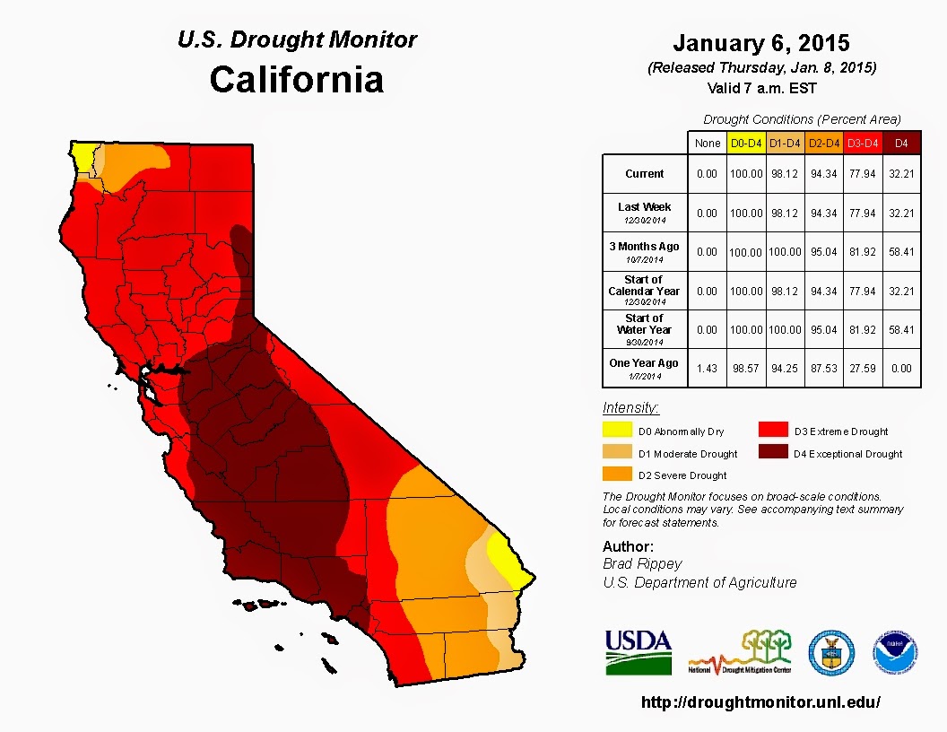 |
An example of a successful map.
Source. |
This map can be considered well-designed in that
it upholds several Tufteisms. Of the ’20 Tufteisms,’ this map follows the
requirement that the map not only be well-designed but also that it convey
complex ideas clearly and efficiently. In addition, the map also delivers the
viewer many ideas (drought conditions are worsening, large areas of California
are experiencing terrible drought conditions) in a short amount of time. The
map clearly conveys relevant information (percent area experiencing a
particular level of drought) and is not filled with clutter or visual noise. It
does not take the viewer long to see that drought conditions have become progressively
worse over time. The color scheme the author uses evokes the sentiment of alarm
in the viewer. Yellow, orange, and red are often used as colors of warning. The
viewer can clearly see that large portions of the state are covered in red or
deep red which correlate with the severe drought conditions (noted in the
table). This shows that the author can engage the viewer’s emotions. The table included
displays the underlying statistics of the map and it is also laid out in an
easy-to-interpret manner. Should the viewer have any questions, they can easily
see authorship and agency associations and thus inquire further.
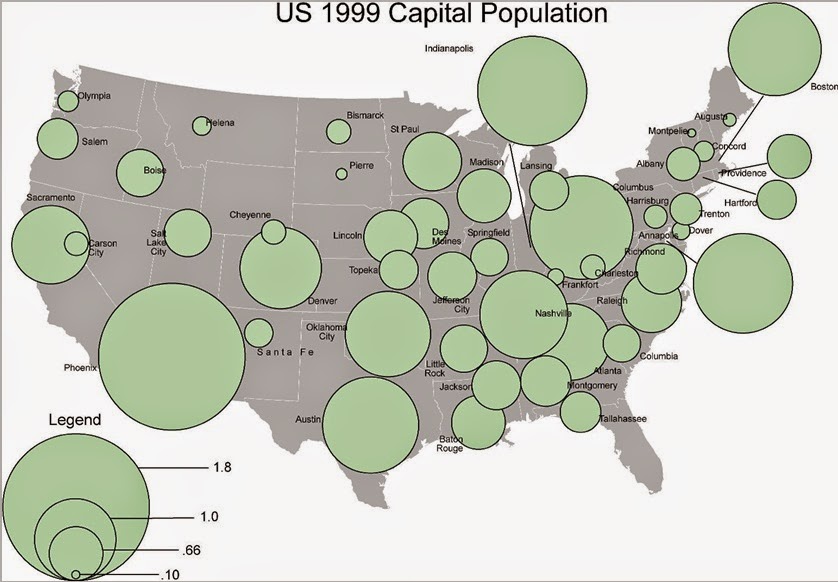 |
An example of a poor map.
Source: Course lab materials. |
From a cursory
examination, this map violates several Tufteisms and map design principles. The
map does not tell the truth about the data (no units of measure), its labeling
system is not clear or thorough (most states are obscured by the “population”
circles), and ideas are not conveyed with clarity or efficiency (What about
capitol populations?). The concept of the map is not easily grasped. The title
is meaningless as it has no context (the map visuals do nothing to illuminate
the aim of the map) and does not summarize much for the viewer other than the
fact that there are US capitals displayed (sort of – many of their locations
are obscured). There is no frame of reference to understand the meaning of the
graphics. The circles partially or completely obscure the capital they are
representing. The circles sprawl all over the map and ruin any attempt of the
viewer at understanding what the map is conveying. The legend data has no units
of measure rendering not only the numbers displayed useless but also their
graphic representation pointless. The design choices leave the viewer unable to
draw any conclusions about the information displayed in the map.
No comments:
Post a Comment