Friday, February 27, 2015

Cartography: Module 7 – Choropleth and Proportional Symbol Mapping

     The aim of this laboratory exercise is to practice mapping a phenomenon using choropleth maps and subsequently symbolizing data using proportional symbols (in either a graduated or proportional manner). Choropleth maps are ideal for mapping a phenomenon that is uniform over an enumeration unit and that changes at an enumeration boundary. The data for this type of map must be standardized and can either be classed or unclassed. A color scheme is also employed in these types of maps. For the purposes of this lab, a sequential color scheme is used in conjunction with classed data. Three choropleth maps were created to represent several population phenomena for Europe. To practice with proportional symbols, wine consumption is also mapped.
     I completed the majority of the lab in ArcMap. I opted to make a custom symbol to represent wine consumption and designed this symbol in CorelDraw 7. I exported my symbol in a format that ArcMap could utilize (a .png image file and used RGB color settings) and imported that symbol using the Customize options within ArcMap.

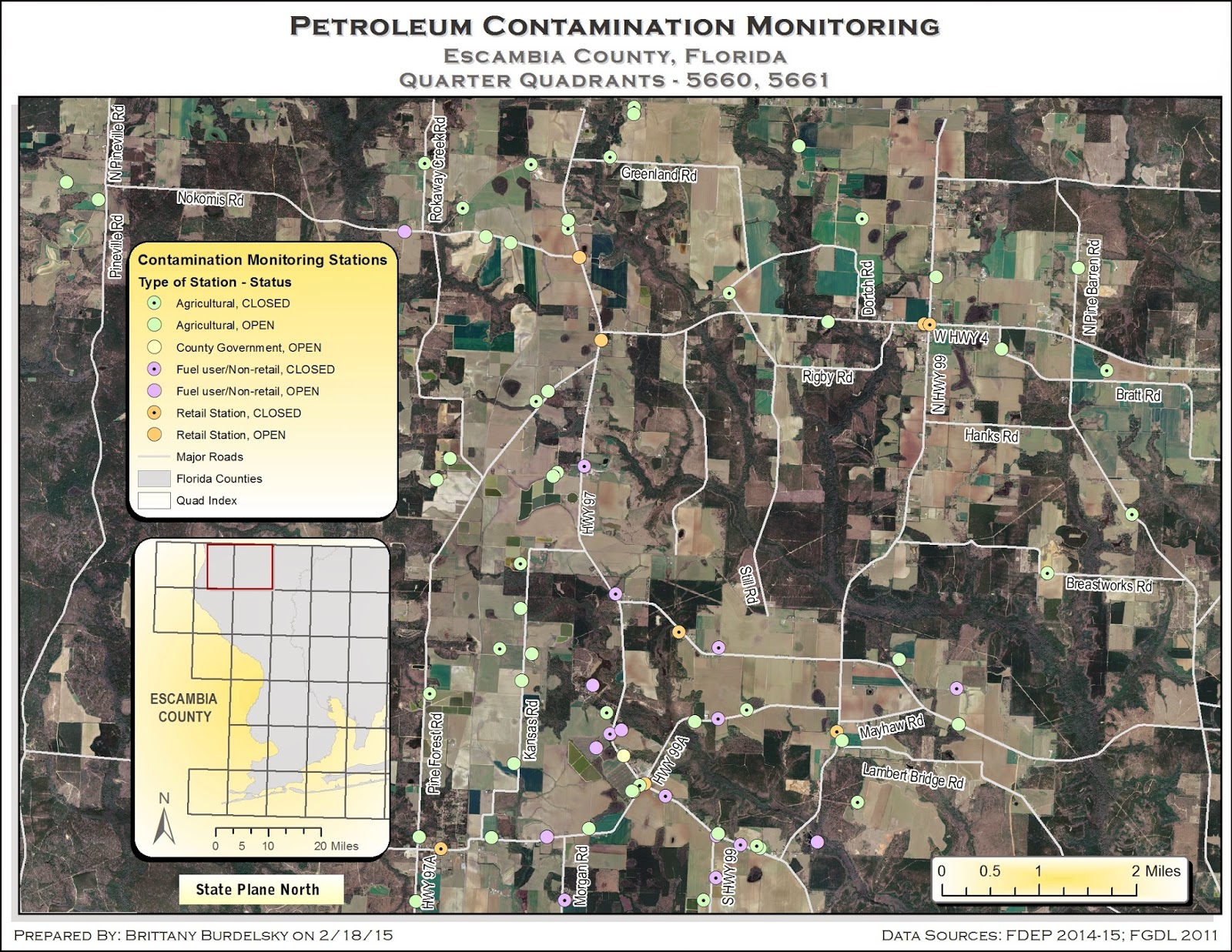
A map displaying various choropleth maps for European
demographic data in addition to per capita wine consumption. 

     My map displays three different choropleth maps for Europe. Female and male population percentages are shown in the two smaller maps while the larger map shows population density and wine consumption per capita. The female and male population percentage maps employ a manual classification system with a pinkish-reddish color ramp. The manual classification scheme for both maps is based upon the natural breaks (Jenks) classification settings (with five classes). I adjusted the first class to include more data. That is, there were several countries that did not report their male and female population data. Thus, the first class initially included only those values reported as 0 (four countries). I thought the data was represented well when that first class was expanded. The same classification method is used for the female and male maps to make their comparisons equivalent and trend comparisons easier.
     Population density, in the larger map, is represented with a color ramp of bluish-green hues and a manual classification scheme. The classification is based upon the quantile method. The other classification schemes (natural breaks, equal area, and standard deviation) did not represent the data well. The manner in which the density data is distributed is such that most of the observations were included in the first class of either the natural breaks or equal area methods (and were within one standard deviation). This meant that one color (the single class containing the majority of the data) covered the majority of the map. As the quantile method puts an equal number of observations within each class, it lent itself better to this particular distribution. I then altered the upper limits of each class boundary slightly causing ArcMap to define my scheme as manual. I generated a unique symbol for wine consumption, an amphora, then imported this symbol into ArcMap. I chose graduated symbols over proportional symbols since the scale of the map is small. The proportional symbols obscured the smaller countries and while it may be a more accurate way of displaying data (does not class data into a range with an associated symbol like graduated symbology) it concealed too much. In  addition, I angled the symbols slightly to reduce some of the shrouding.
     Each map has an associated legend which display the color schemes as a contiguous unit. The graduated symbol legend is arranged with the smallest symbol at the top and the largest symbol at the bottom. A nested legend did not seem appropriate for pictographic symbols. A scale for each map is included as well as the projection used. For fun I am including iterations of the amphorae I attempted to use as well as the symbol I ultimately used.

The first amphora. The shading and lack
of outline made this difficult to use in ArcMap
The next attempt at symbolization.
The color choice was better but the lack
of an outline was still an issue.
Also, the handles on the side are too complex.  
Final symbol style.
The outline and color alterations
help the symbol stand out on the map.

Friday, February 20, 2015

Cartography - Module 6 -- Data Classification

     There are various was to classify and display data on your map. This week the lab assignment focused on methods of data classification. In particular, it reviewed natural breaks, equal interval, quantile, and standard deviation methods. The result is a map displaying these four classification methods for a given dataset. I will briefly discuss each classification method and then my map.
     Without going into too much detail, each method has their advantages and disadvantages. They define their classes differently and thus display data differently. The equal interval method generates classes that have equal ranges while the quantiles method divides the data into classes with equal numbers of observations. Thus, for quantiles, the classes have different ranges. Likewise, the natural breaks method has class ranges that differ. This method uses algorithms to minimize within class variance but maximize between class variance. The final method, standard deviation, performs exactly as it is named. It separates the data into classes based upon their deviation from the mean.
     The exercise was performed in ArcMap using their classification tools within the layer properties menu. Default settings for all methods were used. Standard deviation classification uses a default seven classes while the remaining methods use five classes.

A map displaying a dataset classified using four different methods --
quantile, natural breaks, equal interval, and standard deviation.
      My map shows four classification methods - quantile, natural breaks, standard deviation, and equal interval - using population percentage data for residents 65 and older living in Escambia County, Florida. I chose similar graded color ramps for the quantile, natural breaks, and equal interval methods and a divergent color ramp for the standard deviation method. The latter color choice is best for standard deviation as it represents those values closest to the mean as a particular color and as you get farther from the mean in one direction or another they have two different color ramps (in this case reds and blues). I created a custom gradient for the background of the entire map and used drop shadows for the individual method maps. Each map method has a title and a legend.

Thursday, February 19, 2015

Intro to GIS: Week 6 – Projections Part 2/Data Search

     All maps begin with data and in this exercise the data came, for the most part, from two sources. The source of the aerial data (quarter quadrants) is the Land Boundary Information System (labins.org) of the Florida Department of Environmental Projection (who themselves sourced the data from USGS). The source of the shapefile data is the Florida Geographic Data Library (Metadata Explorer). I practiced searching their databases, finding the information I needed, and downloading all necessary files. {This lab turned out to be an exercise in organization as well since there was a lot of data to manage.}
     Once I had all the data I needed, I had to work on rectifying their coordinate systems. Thus, the main goal of this lab – to improve working knowledge of coordinate systems. The raster data (aerial data)  possesses a native coordinate system different than that of the other layers. After loading all of the data into ArcMap, I reprojected any “mismatched” data into the coordinate system of the aerial data. This is a crucial step if a map reader is to discern anything useful from your map. This is especially the case in the event of analysis. A map would be meaningless if its data was in various coordinate systems.
     Another new skill the lab introduces is calculating tabular data. I used a spreadsheet to calculate the x and y coordinates from latitude and longitude data (degrees, minutes, seconds to decimal degrees). This information, when imported, lacked a defined coordinate system. Once it was defined, the point data aligned with the rest of the layers on the map. Additionally, I reinforced some skills I learned in previous labs like converting text to annotations and adding extent indicators to an inset map. The final product of the lab is the map below.
A map displaying two adjacent quadrants within Escambia County, Florida.
Locations of monitored petroleum tanks are shown and explained in the legend.
An inset map with quadrants over Escambia County shows the extent of the quadrants under examination.
     My map displays two quadrants (5660, 5661) from the northwestern portion of Escambia County, Florida along with the locations of petroleum tanks monitored for contamination. Major roads are included to provide greater context within the mapped area. The point data are represented by circles that are colored by type and symbolized (as an open or dotted circle) by status. I noticed a large empty space in the western portion of my mapped area. I filled that space with the legend and inset map. The aerial data is busy so I opted for pastel colors that can be easily picked out but do not add to the background clutter. (Perhaps it is time to learn about layer transparency). I added drop shadows to the legend, inset map, and scale to lift them off of the background. I added masks to the road name text. I thought this made them more legible against the aerial images.

Friday, February 13, 2015

Cartography: Module 5 -- Spatial Statistics


     This week was another foray into the ESRI Virtual Campus. I completed the course, “Exploring Spatial Patterns in Your Data Using ArcGIS.” This course focused on the analysis of data using spatial statistics tools found in the Spatial Statistics Toolbox and the Geostatistical Analysis extension. Upon finishing the course, I passed a quiz and was awarded a certificate. What follows is  a brief discussion of the tools used and a map that shows some of what I did within the course. 
     A visual assessment of mapped data is a preliminary analytical step. You can see spatial patterns in your data or note a lack there of. These visual trends are fine but a more in depth evaluation of the data is needed. Spatial statistics allow you to examine the characteristics of your data and leads to a richer analysis than can be provided from a visual perusal. For instance, you may not be able to spot an outlier or if that outlier is affecting your data in any way. With the spatial statistics tools provided in ArcMap you can find the median center, mean center, and directional distribution of the data. These tools are found in the Spatial Statistics Toolbox. To take the analysis further you can use the tools located in the Geostatistical Analyst extension. This toolset will display your histogram, QQ plot, semivariogram, Voronoi map, and the global trends within the data. These tools will help you discover if your data is normally distributed, their frequency and variation, and the presence of outliers. In addition, you can see a 3D trend analysis (that you can rotate in real time...pretty neat) and if your data is spatially autocorrelated. 
     The map I am displaying is a result of the first exercise in the course. The goal of the exercise is to examine the spatial distribution of data. For this exercise, I examined weather monitoring stations in western and central Europe. The mean center, median center, and directional distribution ellipse are all displayed. The mean center, represented by the purple diamond, is the average location of the dataset. From this calculation we can see that while there seem to be some clusters of weather stations, there is enough of a dispersion to put the median roughly in the center of western and central Europe. The median center, represented by the orange cross, is the middle value of all the locations. The median and mean centers are close but indicate that the data impact them differently. The directional distribution runs east to west indicating that more of the stations are distributed in this direction than the are to distributed north to south. 
     As far as design, the map example provided is very busy and full of information. I placed the legend in an area that seemed to be less crowded and would not hide any information. I also tried to place the north arrow and authorship in uncluttered areas. The source information has some overlay issues but it is embedded in the layer. Attempts to alter the citations were not allowed by the permissions set on the layer. I made the distributed information take up as much of the map as possible without losing geographic context. I also designed thematic symbols to be visually weighted. 
This is a map displaying the data examined and analyzed as part of
an ESRI virtual training course in spatial statistics. It shows western and central Europe
and the location of weather monitoring stations throughout the region. The mean center,
median center, and directional distribution ellipse are also displayed. 


Thursday, February 12, 2015

Intro to GIS: Week 5 – Projections Part

   This week, and next, the lab exercise examines the characteristics of map projections. The purpose of this lab is to examine (both visually and numerically) a geographic area (in this instance, Florida) transformed by three different projections. To help understand how data is altered by a particular projection, area information for select regions are compared. The result of this exercise is a map that displays the state of Florida in three different projections and includes comparative data for the areas of select counties.
     Three projections are used in this exercise. Albers Conical Equal Area is the native projection of the original shapefile. Universal Transverse Mercator and State Plane North are the other projections used for comparison. I learned how to use the Project tool to alter the projection coordinate system of a layer and also how to select a geographic transformation to go from one geographic coordinate system to another. The lab also reinforces how to select features (by way of the attribute table) and generate a new shapefile from those selections. Below you can see the map I produced for this exercise. The description of the map follows the map image. 
A map displaying Florida as it appears in three different projections.
Areas of select counties are summarized in a table to aid in
understanding how a particular projection alters data
.
     My map shows the state of Florida in three different projections. Each map has the same counties highlighted – Alachua, Escambia, Miami-Dade, and Polk. A table of comparative areas is provided to show how data is altered by a given projection. I used a gradient fill for the main background to help create a proper figure-ground relationship. This helps to highlight the three maps of Florida. To maintain a design balance, gradients are also used in the Florida maps and accompanying table. I used blues, yellows, and tan to create a color theme and unify the visual input. I chose to use a single legend as I thought this would keep the map from becoming cluttered. I represented each county with unique color values through a color ramp. The lightest shade of blue corresponds to the county with the smallest area (as noted in the table) and as the blues become darker the areas represented become larger. I chose not to include area information within the legend as I would have had to include a different legend for each map and again, I wanted to keep it simplistic. This is ultimately an esthetic choice since some map users may find the map table off putting and prefer multiple legends. 

Thursday, February 5, 2015

Intro to GIS: Week 4 – ArcGIS Online and Map Packages


     Occasionally, there is a need to share GIS content with a colleague who is elsewhere. It is fortunate then that there are ways to share and collaborate through ArcGIS Online by Esri. It is also advantageous that Esri offers training through their Virtual Campus. This week’s assignment focused on taking two of Esri’s virtual courses to familiarize oneself with ArcGIS Online. The first course, “Creating and Sharing GIS Content Using ArcGIS Online,” introduces what ArcGIS Online is and what it is capabilities. The second course, “Creating and Sharing Map Packages in ArcGIS,” introduces information sharing by way of map and tile packages. I will provide a brief overview of map and tile packages and give an overview of the exercises.

Map Packages versus Tile Packages
     A map package is typically used with vector data as opposed to a tile package which can contain both vector and raster graphics (but they are more suited to the latter). Tile packages are often used as basemaps in ArcGIS applications. The tile package is composed of layers of tiles (images) while a map package contains a copy of the source MXD file, a copy of the data used for that MXD, and any additional documentation.  The type of package you use is dependent upon whether the data is operational or basemap data. A map package is better suited for operational data that needs to be interacted with (queried/edited) and a tile package is more appropriate for complex datasets (basemap-type data).

Brief Discussion of the Exercises
     The exercises are carried out in ArcMap and then shared (by way of ArcMap’s Share feature) with whomever the map maker chooses. Before the exercises begin there is an estimated completion time noted. (The heads up is nice so you know what you are in for.) The map and tile packages to be manipulated are all provided by Esri. The step-by-step instructions include screen shots that allow you to compare your results with those of the exercise. I found the virtual training courses easy to follow and I like that I can return to them and refresh my memory. As a result of a couple of exercises from this training, I shared two different packages on my Esri account. The screen shots you see in this post are screen captures of the base information of this shared data.

Exercise: Use and modify map and tile packages
     I used map and tile packages provided by the course to practice modifying that data for shared use. As part of the exercise I interacted with, modified, and shared a map package. As part of the exercise I learned that it is necessary to remove any tile packages before I can share the map package.    

A screen shot of the base information of the shared data I created as a result of the
Esri virtual course. This course focused on the modification of map and tile packages. 


Exercise: Optimize a map package
     This exercise worked through an example in which you are an employee for a land management agency. You need to share your information with fellow employees and have this information easily accessed from the field. Thus, you work through optimizing a map package to do just that. Not only did I work through what was beneficial to include in the map package for fieldwork but I also learned how to include all the necessary item description information.
A screen shot of the base information of the shared data I created as a result of the
Esri virtual course in map package optimization.

Wednesday, February 4, 2015

Cartography: Module 4 -- Map Elements and Typography

     This week we further explored map design by practicing typography. The assignment was to place various labels around Marathon Key, Florida. Some of the labels presented challenges that required decisions to be made about placement. That is, there are optimal places for labels to go when they are to accompany a symbol. With this in mind, the small area of the land mass of Marathon required me to make some decisions and bend some cartographic typography rules. There are two labels, one for a key (Duck Key) and a country club (Sombrero Country Club) , that overlay the border of the key with the ocean. I chose to place them here because neither a mask (either around the letters or as a text fill background) nor a leading line looked proper. In the case of the text mask, the size of the type was too small for it to even be made out and created more confusion than it was worth. In creating a background fill for the text it obscured the geographic features even more than leaving the plain text. I thought to include leader lines but they looked distracting and out of place. I tried to keep with the general pattern of the rest of the labels. Thus, I chose to keep their placement despite their overlap and slight clarity issues (technically, overprinting). I feel the labels look much more uniform and harmonious despite some overprinting.
     When labeling the water features I used italics and colored the text blue to easily differentiate it from the other labels. For two of the water features I broke the general rule to keep type horizontal. In the case of Boot Key Harbor (southwestern portion of the map), it is such a small area that I decided to follow the curve of the water feature with the label. I did the same with Vaca Key Bight to avoid overlap with the country club label. For the key (island) labels I chose to use all uppercase letters to distinguish them as areal entities as opposed to simply place names (like a city or public place).

     I made use of the skills I learned in last week’s cartographic design lab in composing the remaining elements of this assignment. The title and inset balance each other on a diagonal from the top left to the bottom right. This is logical as we not only read left to right but these elements fill the empty space Marathon does not fill. I chose a color scheme that adequately creates contrast and contributes to proper figure-ground relationships. I employed drop shadows and gradient fills to create a visual hierarchy by emphasizing the small geographic area of Marathon and weighting the thematic symbols.

Map of Marthon Key, Florida with particular keys, water features, cities, and facilities noted.
This map helped to hone typographic skills in cartographic design.
The small area of Marathon presented textual design challenges that I had to overcome.
     My map shows Marathon Key, Florida with particular facilities, cities, water features, and keys (islands) noted. It was entirely designed and altered within CorelDraw x7. Essential tools were the Text tool for all of the labeling, various Shape tools for thematic symbols and borders, and grouping objects. I enlarged the area of Marathon by grouping all the curves that comprised it. The map is not to scale and mentioned on the map itself. This re-sizing eventually created an issue when exporting my map. After some head scratching I realized this was due to the fact that the frame of Marathon extended beyond the page dimensions. As a result, it looked like I had a white matte to the right and the left of the map. To fix this I cropped the image in MS Paint. This map was a great exercise for learning to implement the rules of typography as they apply to cartographic design.