Tuesday, November 10, 2015

Remote Sensing: Module 10 - Supervised Classification

     This week is a continuation of techniques in automated digital image classification. Specifically, supervised classification is covered. Unlike unsupervised methods, this method requires the use of training sites (a priori knowledge) to guide classification. It also uses statistical methods as opposed to Euclidean distance data to assign pixels to information classes. To practice this technique, the lab assignment walks through a supervised classification the process for which is then reproduced to compile the weekly deliverable. The classification was performed in ERDAS Imagine and the map deliverable was made in ArcMap.
     The general method is to import an image, create AOI features surrounding training sites (using the region growing tools and drawing tools), record the signatures from these AOIs in the Signature Editor, perform the supervised classification (via the Raster tab), and then recode this information to represent final class designations. As a result of running the supervised classification, a distance image is also created. This image along with examining comparative class histograms and mean plots (options in the Signature Editor window) examine the accuracy of the classification.
     My map below shows Germantown, Maryland classified via a supervised classification. The Euclidean distance image is included as a reference to the degree of error. (The brighter spots indicate areas that are likely classified incorrectly.) Eight classes are ultimately used to represent the different land uses/land classes. Areas are also included and noted in the legend. The original band combination used is 5, 4, 6 as I felt these bands had the best separability between spectral signatures. As an aside, one of the more difficult things was creating training sites for roads. The borders between roads and everything else for in this image were quite pixelated. As a result, there is a fair amount of error in that class since my training sites may have included the occasional pixel belonging to a different class. When I was growing areas of interest for some of the other classes I also set higher distances between pixels to capture some of the variation in that feature and as a result introduced error into certain classes (particularly the fallow and agriculture classes) and that is validated by the bright spots in the distance image inset.

Map 1 An exercise in automated classification using a supervised classification technique

Tuesday, November 3, 2015

Remote Sensing: Module 9 - Unsupervised Image Classification

     This week we delved into digital image classification. Up first is unsupervised classification, the following module (10) covers supervised classification. Unsupervised classification is an iterative (that is, until a threshold is met) procedure involving the clustering of pixels (with similar spectral reflectance) into classes (a parameter determined by the user). Supervised image classification uses a priori knowledge to guide classification (by way of 'training sites').
     In this lab we took a high resolution aerial photograph of the University of West Florida campus and performed an unsupervised classification (using the ISODATA algorithm) in ERDAS Imagine. The result of which is a thematic raster with a lower spectral resolution than the original photograph. This image was classified into fifty categories. It was our job to reclassify and reduce these categories into one of  five choices: trees, grass, buildings/roads, shadows, and mixed (for pixels that fall into more than one category). This was done by selecting pixels and reassigning them into one of the categories and giving them a designated color. Once all fifty classes were reclassified, the Recode tool was used to reduce the number of classes into the final five. Descriptive data (in the form of areas and percentages) was calculated for each category and for permeable/impermeable surfaces. The map deliverable below displays the classified image and accompanying data.
     ArcGIS was used to make the final map product but it can also run an unsupervised classification by using the Iso Cluster tool and the Maximum Likelihood Classification tool. It is  necessary, however, to possess the Spatial Analyst extension.

Map 1 Unsupervised Digital Image Classification of the University of West Florida Campus

Tuesday, October 27, 2015

Remote Sensing: Module 8 - Thermal Imagery

     In continuing with digital image processing, thermal imagery is introduced. Thermal remote sensing is unlike other forms of remote sensing in that sensors record emitted energy as opposed to reflected energy. A general rule of thumb when examining thermal data is that good absorbers are good emitters of thermal radiation while good reflectors are poor emitters of thermal radiation. Thermal characteristics will also vary by time of day and season which is taken into consideration when planning a study or recording data for a site.
     Thermal imagery has a coarser spatial resolution than other bands because it has a larger instantaneous field of view. This came into play during the lab as there were two choices of imagery for analysis. I initially chose a different image than I ultimately used because I thought it had obvious features (like recently irrigated fields) to identify using the thermal layer (which was the goal of the assignment). The lab, however, wanted the feature highlighted in the map and when I attempted to make the map the irrigated field was too pixelated for useful visual analysis. Thus, the map deliverable below. It shows an image with a better spatial resolution (and I chose a large feature to eliminate scale issues altogether). On the left side of the map is the feature visualized in a band combination (4, 5, 1) that highlights its extent. On the right side of the map is the thermal layer (Landsat ETM+, Band 6) displayed using a red, yellow, and blue gradient. 
     The thermal image shows a distinct spot near the coast that is much warmer than the surrounding water (also note the red areas as evidence of cultural activity/urbanization). When it is visualized in the multispectral image it shows as a bright red swath along the coast. The red is a result of reflected near infrared energy. This could indicate some photosynthetic activity or agricultural runoff. A combination of histrogram analysis/manipulation, viewing the image in greyscale for each band, and the inquire tool (in Imagine) were used to analyze this image.

Map 1: An Exercise in Thermal Image Interpretation

Tuesday, October 20, 2015

Remote Sensing: Module 7 - Image Preprocessing Part 2

     This assignment continues examining image processing techniques by way of multispectral analyses. Different band combinations can be used to tease out information that may be missed when viewing an image in true color. In other instances, true color is the best option for viewing a given feature. What band combination is best is ultimately determined by what feature is under examination.
     Three features were described in our lab assignment and we were tasked with identifying them based on the given criteria. Histogram spikes and trends helped indicate whether a feature has dark or bright pixel values. From there, examining greyscale versions of each band in conjunction with multispectral versions of the image aid in visually assessing trends and confirming patterns in the histogram. In ERDAS Imagine, the Inquire Cursor is invaluable. It provides information about a pixel for each band including its frequency and LUT value. The Inquire Cursor helped confirm the features described.
    Below are the map deliverables for this assignment. Each map shows one identified feature displayed in a band combination that highlights that aspect. An inset map is included in true color to provide a true-to-life context. Without giving away too much detail, the first feature is a water body as the pixel characteristics matched the histogram characteristics provided for a certain layer. The second and third features are snow atop a mountain peak and sediment in water, respectively. The pixel values also fit the given description. Band combinations are noted on each map with a brief note on why that combination is used. t

Feature 1

Map 1 Feature Identification Exercise Using Multispectral Analysis -- Water Bodies 
Feature 2
Map 2 Feature Identification Exercise Using Multispectral Analysis -- Snow
Feature 3
Map 3 Feature Identification Exercise Using Multispectral Analysis -- Variation in Water

Tuesday, October 13, 2015

Remote Sensing: Module 6 - Image Preprocessing Part 1

     This modules covers spatial enhancements and image preprocessing. The exercise introduces the USGS Global Visualization Viewer where satellite and aerial data can be browsed and downloaded. These satellite images can then be imported into ERDAS Imagine for analysis. Some of the Landsat imagery exhibits striping due to a sensor malfunction and in this lab we attempted to correct for this phenomenon with spatial enhancements. These can be performed in either ArcMap or Imagine. Edge detection, Fourier transformations, and other techniques help in getting the most out of remotely sensed data.
     Two maps below show my attempts at image enhancement. The first one is the map deliverable for the exercise. I used the Focal Analysis tool in Imagine iteratively. That is, I performed a focal analysis calculating the mean of a 3x3 kernel (excluding 0 values from the calculations) and applying those values to pixels with a value of 0. Performing this analysis to each end product of the previous analysis (using the same exact settings) results in gap closure. The image, however, is not perfect and there is a disconnect between the gap filled areas and the original data. causing it too look like an improper join. This image is a composite between the original banded image and the modified image. Other methods attempt to fill missing data by using Fourier transformations in conjunction with other filters (low pass, high pass, range/edge detect, sharpening).
Map 1: Image Enhancement Exercise Using Landsat Satellite Imagery
     The second map I created shows some of the end products of combinations of filter effects and enhancements including focal statistics, histogram adjustments, and altering raster display settings. The top left image is the original, unaltered image with gaps. The top right is the image I used in my final map above. The bottom left and bottom right images are composites using the banded image. The bottom left image uses a Fourier transformed, sharpened image. The bottom right image was made by using focal statistics (maximum) and a Fourier transformation. 

Map 2: Various Attempts at Image Enhancement Using Different Methods

     While you can perform these enhancements in ArcGIS, I predominately used ERDAS Imagine. Both programs are great but I like that I could open four views in Imagine and compare them simultaneously. Imagine also lets you preview the alterations which I found helpful. 


Tuesday, September 29, 2015

Remote Sensing: Module 5, Part One - Introduction to Electromagnetic Radiation & ERDAS Imagine

     This week's module broadly examines EMR and its significance in Remote Sensing (how reflection, refraction, scattering, absorption, etc. impact remote sensing technologies). This week's lab is separated into three exercises aimed at examining the properties of electromagnetic radiation and introducing ERDAS Imagine (an analytical tool used in remote sensing in conjunction with other GIS products). (Here is a brief overview by the Office of Surface Mining of Imagine with links to PDF directions). The first exercise concentrates solely on calculations of wavelength, frequency, and photon energy (C = λν and Q = hν) to look at the particle and wave theories of light. The second exercise focuses on understanding the graphic use interface of Imagine as well as manipulating parameters and exploring various types of raster data. The final exercise prepares data in Imagine and exports it for map making in ArcGIS.
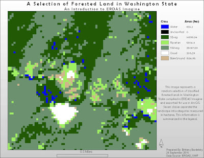
      This third exercise produces the sole cartographic output of the module. To complete this portion I used a classified raster image of Washington State and randomly chose a section (using the Inquire Box tool) to analyze. I also added an Area column to the attribute table. This area data was then incorporated into the legend made in ArcGIS. Imagine has some tricky aspects to it but the layout somewhat resembles that of the GUI of ArcMap. Thus, some tasks seemed intuitive (like right clicking a layer in the Contents panel and editing the attribute table). The Help for this program is also similar to ArcGIS and easy to navigate.
     I included my map below showing the random subset of forest land I selected. The legend shows the seven raster classifications with their concomitant areas in hectares.  
Map 1: A Map Exercise Using a Classified Forest Land Raster of Washington State.

Tuesday, September 22, 2015

Remote Sensing: Module 4 - Ground Truthing and Accuracy Assessment

     I recently attended a workshop on non-destructive means of archaeological survey. We discussed photogrammetry, magnetometry, photogrammetry, and LIDAR, among other things (like soil resistance). In all of these methodology discussions, the researchers drove home the point of ground truthing. This can be a challenge if the area in question is truly remote. Or, as a distance learning student for instance, I cannot actually visit the sites we use in our lab exercises. For situations like this it is necessary to use high resolution (at least higher than the original imagery) imagery to assess the accuracy of land use and land cover classifications. For this course, we use Google Maps to examine the accuracy of the classification exercise performed the previous week.
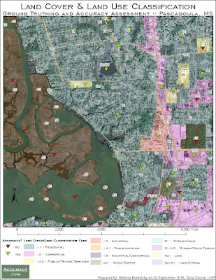
     There are several ways to design a ground truthing/accuracy assessment survey. The method chosen is a function of available resources (time, man power, budget). I chose a stratified random sampling method wherein which I chose a random point location in the various classification groups. I tried to create a representative sample with at least a single random observation in each category. The random points were checked against Google Maps street views or for areas where there is no street view zooming in as close as possible.
     Typically an error matrix is generating to examine overall accuracy, user accuracy (commission error), and producer's accuracy (omission error). For this assignment we were only asked to calculate the overall accuracy (percentage of correct classifications). Below is the map deliverable showing the overall accuracy percentage and the points used for accuracy assessment. I had the highest success in identifying residential areas and the lowest success at classifying vegetation (time for more hikes!). I also experienced some confusion between commercial and industrial. This exercise was incredibly helpful and addicting. It was hard for me to not spend too much time on every part of the map. The best feeling for me was starting to familiarize myself with Pascagoula. I was getting to the point where I could orient myself by "landmark" shapes of roofs, water towers, and schools.


Map 1: Land Use/Land Classification Ground Truthing and Accuracy Exercise 
If I ever find myself in Mississippi, I may have to make my way to Pascagoula just to ground truth my virtual ground truthing.

Monday, September 14, 2015

Remote Sensing: Module 3 - Land Use Land Cover Classification

Introduction to land use versus land cover

     The focus of the project this week is to identify and classify different land uses and land cover types. This exercise builds upon last week's work with recognition elements. It provides an introduction to another use of aerial photography: assessing natural and urban resources. There are several different classification systems and their usefulness depends upon the scale of the research question or goal of the project. This exercise referenced the USGS Standard Land Use/Land Cover Classification System up to Level II (and for a few instances, Level III).
     Tasks for this lab included deciding upon a scale to use,  generating a visual standard using recognition elements (to ensure uniformity and consistency), and digitizing features by use or cover type up to Level II classifications. [A more practiced eye will no doubt find error in my classifications but bear in mind that we were only asked to spend up to 4 hours as we will be revisiting this map in a later exercise.]
     The map deliverable is shown below. This area (Pascagoula, MS) is largely dominated by urban/built up land and to a lesser extent water with forest land. I was able to identify commercial areas, industrial areas, main roads, and public/private service areas (like schools, cemeteries). I used the same ArcGIS tools as last week to digitize these features and modify their attributes in the attribute table. It was easy to get lost in this assignment. Once you start to really recognize features it became hard not to classify every minute change in land use/land cover.
Map 1: Land Use/Land Cover Classification Exercise  
As a personal aside, I flew back from Washington earlier this week and was able to get live practice at identifying land use and land cover. I played a sort of I Spy and saw agricultural areas, pastoral land, small towns, the airport (obviously), and mountain ranges to name a few things. At any rate, I had a GIS/carto nerd moment.  

Tuesday, September 8, 2015

Remote Sensing: Module 2 - Interpreting Aerial Photography

     This module introduces aerial imagery interpretation. There are several elements of interpretation that help in determining what features are in aerial imagery. Tone, texture, size, and shape are among the basic elements while pattern, shadow, and association are more complex methods of interpretation. Independently and in concert these elements help in the analysis of an image.
     Three exercises in this lab aimed at practicing aerial image interpretation. The first exercise deals with the basic elements of interpretation. The second involves slightly more advanced elements such as pattern and association. The third exercise has no map output but involved examining the color of features in true color imagery (colors we can see) versus false color (other wavelengths). What follows is a more detailed discussion of each exercise and the maps created as a result. 

­Exercise 1
     Tone and texture in this exercise are identified and classified based upon increasing tonal values (very light to very dark) and a range of textures (from very fine to very coarse). Identifying tone is intuitive as the lightest and darkest portions of the image are easily identified (see the screenshot below). To aid in assessing the tone differences I used a grey scale. Texture, however, is not as straightforward. While I felt that I appropriately classified texture, another image analyst may feel what I designated as mottled is actually coarse. It seems more subjective than identifying tone. Below is the map I generated showing areas classified within a range of textures and tones. Five areas for each category are included. For tones, the classes are very light, light, medium, dark, very dark. For texture, the classes are very fine, fine, mottled, coarse, and very coarse.   

Exercise Map Product - Tone and Texture
This map shows various regions highlighted and classified by tone and texture.
Tone classifications range from very light to very dark while texture ranges from very fine to very coarse.
Exercise 2
     In this exercise the elements shape, size, shadow, pattern, and association are used to identify various features in this image. Three features are identified in each one of these categories with association being the exception with only two features. In the shape category, I identified a body of water, a road, and a swimming pool (difficult to see in this scaled down map). Each of these features have a distinct shape and size that allowed me to identify them. The swimming pool, for instance, is uniquely shaped and relatively small when compared to the other water features in the image (and also by association, near a residential area). Using their shadows I was able to identify a sign post, pier, and water tower (also a unique shape). Pattern is one of the higher order visual elements and I used different scales to determine the patterns of various features. When the image is at full extent, the coastal vegetation and residential areas are readily apparent but the parking lot looks like an indistinct, grey rectangle-like area. When that area is magnified the white, ordered outlines of the individual parking spots become visible and therefore easier to analyze. The last identification category is association. These features are identified by their context. For instance, I identified what looks like a motel based upon its shape and surrounding features (like signage, a small swimming pool between two mirrored buildings). The beach is also obvious based on its association and proximity with the ocean, pier, coastal vegetation, and strip of buildings lining it.
     The final output is seen in the screenshot below. Each feature is marked by a colored symbol that is representative of the identification element used.   
 
Exercise Map Product - Interpretive Elements
This map displays features identified by shape/size, shadow, pattern, and association
(combining multiple factors to come to an interpretive conclusion). 
Exercise 3
     For this portion of the lab, I looked at a true color image and compared features identified in that image against those same features in a false color version of the image. The goal is to become acquainted with viewing the world in alternative wavelengths/colors. As an example, the true color of vegetation is green but in a false color infrared image (where red light is green, green light is blue, and near infrared is red) those same plants will display in red. This is a function of the type of light that plants reflect (near infrared and green) and absorb (red). It is fun to view the world in alternative color schemes and also incredibly informative. In the plant example above, the redder the vegetation typically the healthier it is. There is much information to be gathered by examining alternative spatial resolutions.  

Map Composition
     I used the Draw tools to create polygons and point locations in their respective exercises. The Editor tool was used to modify the attribute tables of the layers created by using the Draw tool (converting drawings to graphics and saving as .shp files). 

Friday, August 7, 2015

GISProgramming: Module 11 - Sharing Tools

     I dabbled in the previous modules with sharing a zipped file of a toolbox containing tools/models. This module took sharing tools a step further by introducing additional ways of sharing, not only using a zipped file but sharing over a LAN or with ArcGIS Server (beyond the scope of this course). For this assignment we zipped our data because we neither share a LAN nor do we make use of ArcGIS Server. I practiced preparing files and creating tool documentation for a shared tool called the Random Buffer Tool. This tool takes a bounded feature and generates random points within it and surrounds those points with a buffer. A screenshot below shows the tool interface. Programming the parameters is discussed below. 
     Providing help documentation is beneficial to the user of your tool. This is accomplished through editing the Item Description in ArcCatalog. Once sufficient detail for the tool is provided the tool can be prepped for sharing. It is recommended that the script be embedded in the tool and protected against tampering with a password. 


sys.argv[] versus gp.GetParameterAsText 
     The script for the tool had to be modified to remove hard coded paths. This serves as an example or cautionary tale for sharing a script tool. Hard coded paths do not or may not exist on the computer of the person(s) you shared the tool with thus necessitating their replacement. Those file paths are replaced with lines of code accepting user input (their designated file paths and workspaces). This is done using sys.argv[] or the gp.GetParameterAsText(). The latter code is preferred as it possesses no character limit. Older scripts make use of the former so it is useful to know how it functions as well. Both use parameter index numbers differently, sys.argv[] begins indexing at 1 (because 0 indicates the script itself) while gp.GetParameterAsText() begins indexing at 0. For the code to run properly it is important that the parameters in the tool dialog box are called correctly by their index number in the script.     

Tool interface. While it currently shows a description of what the tool does,
clicking in the parameters provides a description as well (inArcGIS). 

A screenshot of the result of running the Random Buffer Tool.
It shows a bounded region containing random points with surrounding buffers. 
     This is the last post for Python programming with GIS. This past semester has flown by and I have learned not only about how to automate geoprocessing tasks but about myself. I can code. I can learn code and implement code and I am confident that I can understand other programmer's codes, debug my code, and compose new code. I am also comfortable seeking out help through classmates/colleagues or outside forums.
     When I started the certificate program I joined a GIS listserv. After this programming course I feel comfortable engaging the GIS programming community on the listserv. Hopefully I can make someone's day, and mine, by helping solve a coding issue and continuing to grow as a programmer and GIS practitioner. Thanks for following.

Thursday, July 30, 2015

GISProgramming: Module 10 - Creating Custom Tools

Creating Custom Tools   
     Custom tools. As if automating geoprocessing tasks with Python couldn't get any better, you can integrate your scripts with ArcGIS toolboxes to make custom tools. The general process is as follows (if you already have a script in mind):
1) Create a toolbox in ArcMap in a logical location
     For this exercise, the toolbox went into a Scripts folder containing the script that'll be used to              make my custom tool.
2) Add the script to your toolbox, creating a new tool.
     It is prudent to make a copy of your script and give it a different name as you'll be modifying the        script to suit designated tool parameters in a later step. This allows you to retain the original                should anything go awry. Right click on this new toolbox, select Add > Script. Navigate through        all the options in the Add Script wizard. (Test the tool to make sure you get the desired result.)
3) Set parameters for your new tool
     This can be done in either of two ways. You can set the parameters through the Add Script wizard (initial dialog window) or through the Properties box of the tool (accessed through right clicking your tool). Once parameters are set within the tool
4)  Modify your script
     Set parameters in your script by replacing file paths and file names with the corresponding parameter index within the tool (using the .GetParameter() function). Replace any print statements with message statements (like the .AddMessage() function) to ensure the progress of the tool is being reported in the Results window and progress dialog box.


Example: A MultiClip Tool
     The general process explained above was used to create a custom MultiClip tool. I took a pre-existing script and modified it to meet parameters specified when creating the tool in ArcMap. This tool runs the Clip function on multiple layers simultaneously. I took several screenshots highlighting the tool interface, the results window, and the spatial result of running the tool.
The tool interface for a custom tool made in ArcGIS using a Python script.
Note the four tool parameters which have corresponding lines of code within the script.
The tool results window displaying messages displaying the progress of the tool. 
The spatial result of running this tool.
Several layers are clipped to a given spatial extent.  


GISProgramming: Participation Assignment 2 -- GIS, Computer Science, and Archaeology

     In the vein of the previous participation assignment I found an article regarding GIS in archaeology. This article discusses the use of a WebGIS to share all manner of archaeological data (maps, aerial imagery, geophysical survey data, and excavation reports). This provides a useful, interoperable platform that georeferences various types of archaeological data for a given site. The article provides a great overview of Open Geospatial Consortium standards ensuring interoperability, metadata standards, and open source GIS programs. It also reviews the web architecture (a framework that uses a Python environment — Django). Data is uploaded as an ESRI shape file (vector) or GeoTIFF (raster) and then the user is prompted to provide metadata and set access privileges.  
     The matter of secure access is discussed since there are various academic institutions involved. Certain functionalities are given to registered users versus unregistered users creating a user hierarchy. The authors also addresses cooperation between various institutions. The authors are developing this system for Aquileia, Italy. This site is a region of international research interest, meaning there is a wealth of archaeological data to potentially share with remote colleagues. Not only would a site-specific WebGIS be fostering a cooperative environment it also provides an open-source platform that can quicken the pace of discovery and analysis. A WebGIS is also cost-effective (a major concern for any researcher/academic institution). I can see this framework having great utility at an archaeological site. There are issues to work out like which institution bears the ultimate weight of developing and maintaining the host site as well as who would ultimately be in charge of overseeing content. This would require that an archaeologist have an understanding of IT or be able to outsource to an interested computer science colleague (a great way for inter-departmental cooperation). At any rate, what an excellent way to gain an in-depth knowledge of a site while communication with fellow researchers. GIS is quickly becoming an integral, necessary aspect of archaeological research.

Citation
Gallo, P., & Roberto, V.  (2012).  ANTEO: Sharing Archaeological Data on a WebGIS Platform.  In  L. Fozzati and V. Roberto (Eds.), Proceedings of the 2nd Workshop on The New Technologies for Aquileia. Retrieved from http://ceur-ws.org/Vol-948/paper3.pdf

Friday, July 24, 2015

GISProgramming: Module 9 - Working With Rasters

     Last week we examined vector data and geometries. This week's assignment looks at the alternate data type used in GIS, raster data. This module covers examining and manipulating raster data programmatically. To do so, the Spatial Analysis extension must be licensed and enabled. Writing in code that checks for the extension/module is helpful for ensuring that any person who makes use of the program on their computer doesn't get an error but instead receives a message the the extension is not available to them. The program I wrote this week does just that. If the extension is licensed then the program runs to completion. If the extension is not available then an alternate message prints that the user does not have access to the extension.
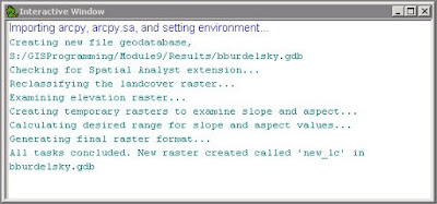
      For this programming exercise, we do have access the the Spatial Analysis module. The module is imported with all of its tools. Two particular rasters are used, a landcover and elevation raster. The Remap class and Reclassify tool are used to reclassify landcover values. Then, a particular range of slope values and aspect values are used to select specific parameters of the elevation raster. All of these raster outputs and selections are temporary. They are combined using map algebra and the final raster output is saved as a permanent file. Below is an image of the final raster result. There is also a screenshot of the interactive window showing the progression of the program by way of print statements.
    
The final raster result showing reclassified landcover data
that has a specific range in slope and aspect.

Screenshot of the interactive window showing print statements that track the progress of the program. 
     I found this program much easier to write than last week's foray into geometries. The geometries program required nested for loops and this program only required a single if/else statement (which I find conceptually simpler perhaps due to previous exposure in a different programming language).  

Friday, July 17, 2015

GISProgramming: Module 8 - Working with Geometries

     This module focuses on working with geometry objects. All features are comprised of a set of points. These points are the vertices of a feature and they are accessed through geometry objects. Whether reading or writing geometries, geometry tokens (SHAPE@XY, SHAPE@, etc) act as shortcuts for accessing specific properties of a feature. Cursors are integral in accessing geometries or creating new geometries. The previous module introduced cursors which helped writing this week's script as I needed to use them again. The program this week practiced reading geometries and writing point data to a text file. 
     The program accesses the Object IDs, point data for all vertices, and attribute data (such as the name of the feature) for features in a polyline shapefile (by way of the Search Cursor). Using a series of nested for loops, the point data for the vertices is gathered and written to a text file (.getPart(), .write, and string module). Below is a screenshot that prints the data (that was simultaneously written to a text file). The program also contains print statements to keep track of what steps of the program have been accomplished.
A screenshot showing the results of a program that
writes geometric and attribute information to a text file. 

     While I found this module conceptually straight forward, I had some issues writing the script for this program. Specifically, I had issues writing information to a text file. This was mostly due to improper syntax and an incorrectly tabulated iterative line of code. Once I let it sink in that the Search Cursor returns tuples, I found the syntax much easier (like properly referencing and printing the data within the tuples). The solutions to my issues were so simple but I got really hung up on them. I hope my DUH moments are easier to catch in the future. 

Thursday, July 9, 2015

GISProgramming: Module 7 - Exploring and Manipulating Spatial Data

     This module introduced exploring and manipulating spatial data with cursors. This week I worked specifically with the Search Cursor to find certain features in a feature class and fill a dictionary with those selections. Cursors are part of the Data Access Module within ArcPy. Also introduce this week was the Describe function.  The combined use of these tools and functions helped accomplish the aim of this week's assignment. 
     My goal was to produce a program that carried out several tasks -- creating a new geodatabase, moving files into that geodatabase, using a Search Cursor to select specific features in a feature class, and then populate a dictionary with those selections. It did not take long to write this program but I was held up by the Search Cursor. Optionally, the Search Cursor can include a where clause for an SQL query. The particular query I wrote used a combination of single and double quotations. That is an issue for Python, as it will try to interpret these quotation marks as strings and confuse where the string begins and ends. Escape clauses are the solution but I had difficulty employing them successfully. I kept receiving syntax errors for this line of code. My solution was to write a variable for the where clause/query an avoid the escape clauses altogether. This worked well and the program could finally run to completion.  
     I have included a screenshot of the interactive window for this program. I wrote in print statements before and after each task I needed to perform to help keep track of the progress of the program. I found this one of the more difficult programs to write. I usually arrived at a solution quicker for other programs but once I spent some time looking through forums and various ArcGIS Help pages I was able to get work arounds for errors I was encountering. Again, the satisfaction in solving my issues and getting my program to run was great. I hope that I am able to keep this up as the programs and concepts become more difficult. 


An interactive window screenshot of a program that uses print features to track several tasks including creating a new geodatabse, using a Search Cursor to gather specific data, and population a dictionary with that data. 

Friday, June 26, 2015

GISProgramming: Module 6 - Geoprocessing with Python

     Just as in last week's assignment, geoprocessing is covered albeit with a greater emphasis on using Python. The assignment this week focused on writing a script that performs three geoprocessing tasks: adding coordinates to a layer (AddXY tool), creating a buffer around features (Buffer tool), and dissolving the buffered areas into a single feature (Dissolve tool). The resulting program must also print messages for each task to show that it was carried out successfully in addition to working within a set workspace. Each of these tools and tasks reinforced how to use Python for automating geoprocessing. 
     Writing the code for each tool provided practice not only calling the tools but using the proper syntax for each tool. There are several ways to get help with syntax and they are all convenient and easy to access. If writing code within ArcGIS there are code autocompletion prompts and syntax help in the Python window. ArcGIS Help is also useful in that it provides example code for each tool. It can be accessed using the Search tool (or through your browser of choice). Setting the environment and workspace is an example of using classes in ArcPy.   

A screenshot displaying the results of a program that runs several geoprocessing
 tasks and prints messages to show the tool was successfully run.
     Throughout my code I wrote comments to delineate each line or section's purpose. This helped me keep track of what I had accomplished while writing the code. Once I had finished the code, I found the comments useful "bookmarks" for finding my place in the code. 

Friday, June 19, 2015

GISProgramming: Module 5 - Geoprocessing in ArcGIS

     This week I added some new tools to my GIS toolbox -- batch processing (a huge time saver) and geoprocessing with Python script (by way of ModelBuilder). Geoprocessing in ArcGIS is carried out through toolsets found in ArcToolbox, models made in ModelBuilder, or Python scripts. In the Intro to GIS course, I learned how to use many of these tools and I even took a virtual course that introduced ModelBuilder and its capabilities. This semester rounds out the geoprocessing tool kit by introducing geoprocessing using Python. Now, not only can I make a model in ModelBuilder but I can take that model and export it into Python script to make an even more robust geoprocessing environment -- one that is custom made to suit my geoprocessing needs.

ModelBuilder
     ModelBuilder is a visual programming language and this makes programming intuitive and appealing. The ability to drag and drop shapefiles and tools into the interactive window allows the programmer to easily follow the logic of their model. Both shapes and color increase user friendliness and add an additional level of design appeal. That is, as you manipulate the parameters (symbolized by ovals for input/output and rectangles for tools) of the model, the become colored to indicate their state (color being ready to run and hollow demonstrating insufficient input). When the model is run, the tools and outputs display a drop shadow indicating their successful implementation.

Geoprocessing Scripts
     Python scripting, unlike ModelBuilder, is text-based. One of the great features of models made with ModelBuilder is that they can be exported to Python script. With some tinkering (the resulting script is a skeleton and requires additional information, such as full file paths), the script becomes a more robust version of the model (because it does not require ArcMap to be open in order to run). This script can me made into a script tool by importing it into your custom tool box. It is also possible to share these custom tools by way of zip files.

Geoprocessing in ArcGIS
     Below is a screenshot of the output shapefile produced using the geoprocessing methods discussed above. The assignment asked us to make a model that removes soils that are poorly suited to farming from a given geographic extent, in this case a basin. The model (and script) I programmed takes a shapefile of soil types and clips (using the Clip tool) it to the extent of a basin. A selection (Select tool) is made (SQL statement written) to chose soils from this new output that are classified as "not prime farmland." The selected soils are then removed from the basin (Erase tool) with the final output being a shapefile displaying only a subset of the soils from the original shapefile remaining.  

A screenshot of the result of geoprocessing in ArcGIS using a model written in
ModelBuilder (with an accompanying Python script that produces the same result). 


Friday, June 12, 2015

GISProgramming: Participation Assignment 1 -- GIS In the News

      I have mentioned before that our courses provide us the opportunity to engage in discussion (and help one another with assignments) with fellow classmates through a discussion board. This is an important resource as this is an online certification program and we do not get to interact in person (though we do have a nifty program that lets us video chat with each other). This participation assignment had us seeking out instances of GIS in the news by way of scientific journals, blogs, or news outlets. I have increasingly noticed news outlets, like NPR, NYTimes, Huffington Post, use maps or refer to maps in their reporting. Often, these maps are compiled using GIS software and possibly even using Python to speed along their analyses.
     To complete this assignment I looked up recent scientific articles that used GIS in an anthropological framework. As an anthropologist, I wanted to see how GIS is being used in this discipline. Additionally, I chose to examine the application of GIS in an archaeological setting as I am currently pursuing a career in archaeology.
     The particular article I chose recognized the utility of spatial analysis within a GIS and its powerful capacity for discerning archaeological patterns. This study uses GIS to analyze the spatial distribution of remains (human/faunal), artifacts, and the presence of ochre in a cave used by Paleolithic peoples in present day Cantabria, Spain. A combination of QGIS and ArcGIS 10 were used to georeference excavation photos, create a 3-D polygon surface of ochre distribution (by way of the Triangulated Irregular Network tool), and reconstruct human body positions with XY-coordinates and vector data.
     The article includes figures that highlight the results of the various spatial analyses performed. These analyses helped characterize the site and preparation of the area for internment. Taphonomic analyses in conjunction with spatial analyses of the burial at this site resulted in its classification as a disturbed primary burial. The authors of this study propose using spatial analyses as an analytical means for studying Paleolithic burial activities. This multidisciplinary approach, merging geographic science and an anthropological/archaeological framework, is exactly what I want to adopt in future endeavors. 

     As an aside, I recently attended a workshop on non-destructive survey methods in archaeology (through the National Parks Service). The workshop exposed me to ground penetrating radar, magnetometry, and other geophysical survey techniques and how these can be integrated within a GIS to understand a site. It blew me away. I cannot wait to apply all of the skills I am learning through this certificate, especially Python, in a career in archaeology/anthropology. 


Citation
Geiling, J.M., Marín-Arroyo, A.B., Spatial distribution analysis of the Lower Magdalenian human burial in El Miron Cave (Cantabria, Spain), Journal of Archaeological Science (2015), http://dx.doi.org/10.1016/j.jas.2015.03.005

GISProgramming: Module 4 - Debugging and Error Handling

     Debugging! This week was all about identifying and fixing errors in code. Some errors are simple to spot and easily fixed, such as incorrect spelling or spelling inconsistencies, case sensitivity, and incorrect indentation, to name a few. Other errors are not easy to see immediately, such as exceptions. These require the program to run to encounter the exception. The handy thing about Python is that it will provide information about the type of error and its location. For instance, exceptions will display in the interactive window stating the line in which the exception was raised.
     We were given several scripts to comb through to practice finding common errors, syntax errors, and exceptions. We also gave running a program in PythonWin debugger a try. I will go through each script and describe some of the errors I found and corrected. No logic errors were addressed in these exercises, only syntax errors and exceptions.  

Script 1
    The first script had two errors. The first error was a simple capitalization mistake and easily fixed. The second error was an exception that I did not catch until I tried to run the program. The exception raised was an "AttributeError." This type of exception is raised when an attribute reference or assignment fails.  I corrected this exception by correcting a spelling mistake. So, I didn't necessarily have to run the program to find this error but it helped me locate the line(s) that contained the error. This was handy because I didn't have to go through line by line and proof read. It, however, would have saved me some time if I had just noticed the spelling mistake in the first place. The screenshot of the interactive window below shows the results of the debugged program. This program gets and prints the names of the fields found in a particular shapefile.

Script 1 
A screenshot of the debugged and error corrected program
that results in a list of field names for a given shapefile.
Script 2
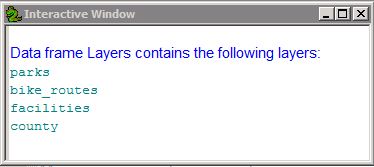
     The second script contained eight errors. As I encountered the errors it helped to write a comment on the side of the line in which I fixed the error. # That way I could keep track of the changes I was making to the script. Some of the errors I encountered were incorrect file paths, spelling mistakes, and a few exceptions (a TypeError and an AttributeError, for example). Once the program was debugged, when run it acquires and prints the names of the layers found in a data frame.   
Script 2
A screenshot of the successfully debugged program that results
in a list of the layers found in the data frame(s) of a given .mxd file.
Script 3
     The final script when run raised an exception. The goal for this script was to get the program to run despite the exception. I added a try-except statement to allow this program to run while printing the type of exception raised. The try-except statement is a handy tool for debugging. At first, I generated a lot of work for myself because I tried to fix the exception raised with a try-except statement but then encountered a different exception when I ran this "corrected" version of the program. I made another try-except statement for this new exception and again encountered another. I could not get this program to run. Then it hit me. I only had to use one try-except statement and then have the program print the exception raised. The program ran successfully after that. Phew. The results are displayed below. When this program runs, an exception is printed and the name, spatial reference, and scale of a given data frame is shown. 
Script 3
A screenshot of the final script in the exercise.
It shows the result of adding a try-except statement to catch
an exception and still run the remaining script in the program. 
     Are you still with me? At first I felt like learning debugging this early in the course was like being thrown into the deep end of the Python pool. This will pay off in the weeks to come, I am sure. I am still a little befuddled by the debugger but that is probably due to lack of exposure. I'd like to think that I will be a careful programmer but no one is perfect and debugging is essential to programming success. Now, if an exception is raised in my future programs I won't panic. Thanks debugging.


[Hopefully my brain won't fall out raising a MemoryError.] 

Friday, June 5, 2015

GIS Programming: Module 3 - Python Fundamentals Part II

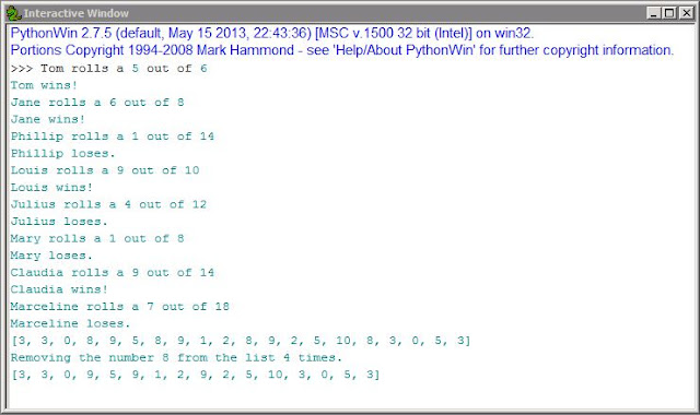
     This week's module continues examining Python fundamentals. Lists, methods, modules, and conditional statements were combined to produce a program with several outputs. This first portion of code was provided but there were two syntax errors that had to be corrected for it to run properly. The next portion of code had to be written from scratch. It needed to produce a
list of 20 randomly selected numbers between 0 and 10. To accomplish this I used a while loop to
populate an empty list with 20 numbers (generated using the random module). The final portion of code had to eliminate a number from that list. I chose the number 8 and used both if/elif and while
loops to remove that number from the list and print a new list devoid of instances of 8.
     What I found most helpful this week was writing out a verbal translation of the aim of each line of code (a method discussed on the class board). In addition, I would write separate, isolated sections of code to make sure I understood how I would accomplish the goals of each portion of the program. For instance, I was having trouble with one of my while statements so I opened a new script and worked through various iterations of the statement until the code worked. After doing this with other portions of the code I felt much more confident that I understood how to control the workflow of the bigger picture. I then combined what I learned from these smaller portions of code to write the final program.
     I should also mention that this is the first program where I included comments throughout the script. Commenting not only helped me organize my code but I felt that in explaining certain portions of the script it reinforced the concepts we focused on this week. Below you can see a screen shot of the program results.

A screen shot of the script I wrote for this module.
It shows the results of a program that runs a dice game,
generates 20 random numbers between 0 and 10,
and  removes the number 8 from that list. 
     I struggled for a few hours but the pieces fell into place and I felt like something clicked because the solution seemed obvious after the fact. While it is not fun to feel frustrated, solving my issues this week felt like a win. I will also note that we have a class discussion board for this course and that is an incredible resource. I just want to give it some public credit because having a community to reach out to when I am confused is wonderful. I am also a part of a GIS listserv and again, what a great resource. It is nice to know that even though I sit and stare at a screen alone, there are others in my course doing the same thing and we are just a discussion board post away.

#Thanks Programming board!

Friday, May 29, 2015

GISProgramming: Module 2 - Python Fundamentals Part 1

     This week we looked at the basic building blocks of Python. Specifically, we combined variables, strings, functions, and methods to write simple code. The script, if successful, prints a given last name and the result of the number of letters in a last name times three (expressed as an integer).
     I think my first instinct was to panic about writing code on my own, albeit simple code. I then remembered what we learned the previous week regarding a logical way to tackle programming. That is, defining the information given , sorting out the goals of the program, and thinking about what tasks will help in achieving the aims of the program. Also, I realized that this program wasn't so bad. In fact, as I looked over what needed to be done the wheels in my head were already turning with how to go about writing this program.
     This may not be efficient in the future but I wrote pseudocode on paper first. I then tried out portions of the code to test them in the Python window of ArcMap. Once I felt like I had it down I composed the final script in PythonWin. You can see a screen shot below showing the result of my script.

This is a screenshot of the result of the program composed for this exercise.
The program prints my last name and the integer value of the number of characters in my last name times three. 
     This was a simple program to write but it is exciting to write code and have it work. I do not mind these ego boosting baby steps. I cannot wait to feel the sense of accomplishment that will come with having finished an entire semester of programming.

Friday, May 22, 2015

GIS Programming: Module 1 - Introducing Python

Start
     Welcome back to my blog. For the next few months I will be detailing my experience with        learning Python for use in GIS. As an introduction to Python we practiced running a preexisting Python script in lab. The program set up the folders and subfolders we will need throughout the course. I included a screenshot below showing the result of running the provided program.
     The lab also had us look at 'The Zen of Python' by Tim Peters. It is accessed by typing 'import this' into a Python window as a command prompt. It is a list/poem of the guiding principles of Python as proposed by the BDFL (Benevolent Dictator For Life), Guido van Rossum.

This is a screen shot displaying the result of the Python script run to
generate folders (and subfolders) for the modules in this course. 
     Our readings focused on introductory information about Python, like it being open source software and the various ways to work with Python (different graphic user interfaces or through command line). For our course we will be focusing on PythonWin (an editor for Windows) and the Python window in ArcGIS. Other readings focused on adopting a problem solving mindset through identifying important variables, determining objectives and goals based on those variables, and creating a list of tasks (implemented to meet goals/objectives).  
End


Thursday, April 30, 2015

Intro to GIS: Final Project - GIS Analysis: Bobwhite-Manatee Transmission Line

     The skills I have learned throughout the semester culminated in this final project. As a class, we were asked to put ourselves in the shoes of a GIS Analyst seeking employment. Thus, we are to demonstrate our aptitude with the presentation of previous work.

     This project required organization of a large amount of data, working with acquired data, and generating new datasets. I also needed to ensure that I could communicate the results of my analyses effectively through a presentation involving appropriate visual aids (maps, charts, tables, etc). To aid in all that organization I used a file geodatabase. There are many advantages to using a file geodatabase. While I was the only person working in this geodatabase, in a professional setting I may have had to coordinate my efforts with others. The geodatabase makes it easier to accomplish group editing and works cross-platform.

A map I created to examine the impact of a proposed
transmission line on existing conservation lands.
     The analysis portion of this project was carried out in ArcGIS and I used PowerPoint to assemble  a presentation for my prospective employer [here is a link to the transcript]. Additionally, I used Excel to summarize the resulting data and compose various visual aids such as pie charts and bar graphs.

     The goal of the analysis was to determine the impact and feasibility of a transmission line that spanned two counties, Manatee and Sarasota, in Florida. I set out to determine if the proposed corridor for the line avoided large areas of environmentally sensitive lands, if it had relatively few home in close proximity, generally avoided schools, and if it could be built at a reasonable cost. The analyses I carried out (a combination of location and attribute queries, overlay analyses, etc) showed that the transmission line met all of these objectives which results in an overall minimal impact on the surrounding community.

One of the maps I created for the analysis of the impact
of a transmission line on its surrounding community. 

Above, to the right, and below, I have placed examples of some of the maps and a pie chart that I used in my presentation. This project took many hours and gave me insight into what it will be like to do analytic work using GIS in the real world. I now have a serious appreciation for all of the effort and coordination that go into utilities projects. (I wonder how they did it before GIS). I hope that you enjoy my presentation and thank you for visiting my blog. It has been a great semester filled with all things GIS (and cartography).

One of the charts I created to help summarize the results of an analysis of the impact of a transmission line corridor on land owners/residents.

In case you missed the links above, here are additional ones:
Presentation
Transcript
   
Thanks again for keeping up with me.