Thursday, January 29, 2015

Cartography: Module 3 – Cartographic Design

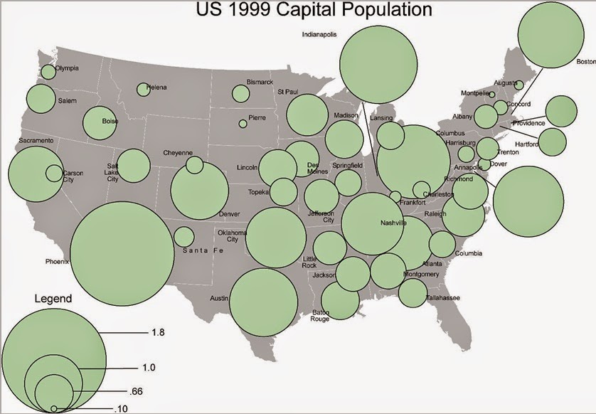
     This week lab focused on incorporating Gestalt principles in cartographic design. Employing these principles aids in conveying a visual representation of the intellectual hierarchy of a map. To that end I graphically emphasized thematic symbols while deemphasizing less important information. I tried to create contrast, a sense of balance, and an effective figure-ground relationship.
     I created my map in ArcMap using the in-program design tools. I practiced using the clipping tool and generating a new layer (using select data from a larger data set). I also explored the sizing of thematic elements by way of a data layer’s symbology properties. I also toyed with typography and some of the more advanced (that is, not default) settings like splined text. I also had to move the various layers around to make sure they displayed properly. Of all of the design elements, I feel I spent the most time on color. I went through several iterations of color choice until I landed on the soft purples.
A map of the public schools located within Ward 7 of the District of Columbia. 
      My map highlights the primary and secondary schools within Ward 7 of Washington D.C. The schools are symbolized the same but sized differently. Primary schools are sized the smallest and high schools the largest. Seven neighborhoods are noted along with the presence of local roads, parks and water resources. Highways and interstates are also included. Like the school symbology, the highways and interstates are colored similarly but weighted differently (with interstates being the thickest lines and state highways the thinnest). I established a figure-ground relationship by using a pale purple for Ward 7 and a darker purple for the surrounding DC area. In addition, I chose a darker red for the highways and pale grey for the roads within Ward 7. Contrast is created by variably sizing the thematic elements and by using a color scheme that visually differentiates the map elements. I attempted to balance the elements of the map by opposing them in opposite corners of the map. The inset map takes up some of the empty space created by the greater DC area while the legend, scale, and north arrow oppose it diagonally. I also tried to position Ward 7’s perimeter as centered as possible. I went with a portrait orientation for the layout because it created less empty space and allowed me to use a larger scale.

Wednesday, January 28, 2015

Intro to GIS: Week 3 – GIS Cartography

     The focus of this week’s lab exercise is cartographic design. I prepared three maps highlighting various aspects of Mexico. The maps show population density, transportation routes/waterways, and topography, respectively. Some of the skills I learned were how to add an extent indicator to an inset map, advanced labeling strategies, creating a new shape file, and choosing an appropriate symbology scheme for raster data. Below you will find a brief description of the content and design of the maps produced in the lab. Overall, I found it fun to display different types of information for the same country. And, all of this practice with color and typography is helping to further fine tune my map making toolkit.     

This map depicts the population density of Mexico.
Population is separated into six classes. 

Map 1 - Population Density of Mexico:
     This map displays the population density of Mexico by state. Population is broken down into six classes. I chose a color ramp in which the lighter hues correspond to the least populated states while the darkest hues represent the more densely populated states. I chose a pale grey for the countries surrounding Mexico to draw the eye towards this country and away from the others. A pale blue for the ocean also aids in creating a proper figure-ground relationship. Essential map elements are all included and do not overlap or crowd one another.

This is a map of central Mexico that displays urban regions
(population > 1,000,000), railroads, federal highways,
and primary/major waterways. An inset map with
an extent indicator is included for orientation. 

Map 2:
     The next map highlights some of central Mexico’s urban regions, roads, waterways, and railroads. Urban areas are defined as those regions that are inhabited by a million people or more. Roads are specifically federal highways while the waterways displayed are primary and major rivers. A network of railway is also displayed. I chose beige to represent Mexico as it is subtle enough to allow the other map features to be easily discerned and not overpowered. The state boundaries are defined by a pale grey so that they too are present but do not overburden the map viewer with additional visual information. Again, essential elements are present. An inset map is included to direct the viewer to the where in the world the map feature is located.

The map shows the topography of Mexico using a raster data set
with a stretched symbology color scheme. 

Map 3:
     The final map of this lab exercise is a topographic map of Mexico. It is a raster dataset unlike the previous maps. I chose a color ramp that was easy on the eyes. I also thought that using a lighter color for midlevel elevations allowed the map reader to quickly discern higher and lower elevations. I then chose a complementary color to represent the countries bordering Mexico to ensure that they would not clash with the visually complex raster data. Essential map elements are present and an inset map is included for orientation.

Friday, January 23, 2015

Cartography: Module 2 – Introduction to Cartographic Design

     The aim of the module this week is to work on cartographic design skills. Particularly, I worked on learning basic graphic design skills to edit and embellish my map. The initial map information was loaded into ArcMap (.mxd) and then exported in a format (.eps) to be loaded into CorelDraw 7. Once in CorelDraw, I added all of the essential map elements and more. The title, legend, city text labels, and symbols on the map were all generated. The geographic area of Florida and scale bar were edited in a manner that maintained their accuracy. The ultimate objective was to create a map that represents, and helps develop, my cartographic aesthetic.
     My map shows the state of Florida with its 67 counties, major cities, and water features. I created a symbol for, and labeled, the state capitol. Two other major cities, Tampa and Daytona Beach, are also labeled. The map includes some state symbols. I used more than a few of these in order to fill up some of the empty spaces on the map. In all I included the state flower, bird, animal, marine mammal, and seal. Tools that proved useful were the text tool, shape tools (ellipse, complex star, rectangle), bitmap tools, and most of the tools within an object’s property menu.

     
Map of Florida displaying major cities, water features, and counties. Personalized with
various state symbol imagery and text, point, and legend customization.  
     I thought this exercise was great for "crash coursing" graphic design. It was, at times, overwhelming. There are many ways to customize any element and when you are first learning the lay of the land it is a daunting task. After much experimentation I am feeling like a pro. Of course, I am far from it but I am less intimidated. If you can read a manual or watch a video online, then it can be figured out.

Map imagery sources: orange blossoms, seal, bird, land mammal, marine mammal.

Tuesday, January 20, 2015

Intro to GIS: Week 2 – Own Your Map

A map of the UWF Campus location within
Escambia County, Florida. 
     This week’s lab assignment focuses on exploring personal cartographic style and gaining a familiarity with customization options in ArcMap. It also introduces inset maps, neatlines, and legend modifications. All of these elements, when designed effectively, contribute to the readability and comprehension of a map. Various elements can be refashioned to suit a particular cartographer’s aesthetic. The result of this lab is a map that exhibits my aesthetic preferences (while trying to keep in mind the tenets of successful map design and, eventually, the end user). I am sure some of these preferences will change as I learn additional cartography skills, have my maps critiqued, and become more comfortable with map design in general.
     The lab walks through how to add layers to a data frame, what metadata is and how to examine it, and how to add a frames around not only an inset but the map as a whole. It introduces new (to me) map modifications like clipping a data frame (bounding information within a particular extent) and editing the symbology of a point on a layer, as well. In choosing the color of Escambia County, I had to begin thinking about color schemes critically. It would not do to color a particular geographic area blue if the map were to also display any bodies of water. The goal of a map to make information clear and not to obfuscate data. So, I went with a color I thought was easy on the eyes. 
     After concluding this exercise, I have a map that shows the location of the UWF campus within Escambia County, Florida and an inset map of the state of Florida. The inset map displays the 67 counties of Florida and their respective boundaries. Additionally, the map shows two interstates (I-10, I-110) near the UWF campus and highlights major rivers. Necessary elements such as a legend, title(s), scale, north arrow, data source, and authorship are also found on the map. This exercise did not take me as long as the last lab. Some of the experimenting I did last week with customization helped me feel confident that I could navigate those options again. I enjoyed taking my first steps toward developing a unique cartographic style. How could that not be fun?


Wednesday, January 14, 2015

Cartographic Skills: Module 1 - Map Critique

This week our lab module focused on critiquing a map using the map design principles established by Edward Tufte and the principles for design created by British Cartographic Society. The following maps were evaluated for quality based on these principles. Each map is accompanied by a short paragraph discussing their design successes or shortcomings.
An example of a successful map.
Source.
     This map can be considered well-designed in that it upholds several Tufteisms. Of the ’20 Tufteisms,’ this map follows the requirement that the map not only be well-designed but also that it convey complex ideas clearly and efficiently. In addition, the map also delivers the viewer many ideas (drought conditions are worsening, large areas of California are experiencing terrible drought conditions) in a short amount of time. The map clearly conveys relevant information (percent area experiencing a particular level of drought) and is not filled with clutter or visual noise. It does not take the viewer long to see that drought conditions have become progressively worse over time. The color scheme the author uses evokes the sentiment of alarm in the viewer. Yellow, orange, and red are often used as colors of warning. The viewer can clearly see that large portions of the state are covered in red or deep red which correlate with the severe drought conditions (noted in the table). This shows that the author can engage the viewer’s emotions. The table included displays the underlying statistics of the map and it is also laid out in an easy-to-interpret manner. Should the viewer have any questions, they can easily see authorship and agency associations and thus inquire further.

An example of a poor map.
Source: Course lab materials.
From a cursory examination, this map violates several Tufteisms and map design principles. The map does not tell the truth about the data (no units of measure), its labeling system is not clear or thorough (most states are obscured by the “population” circles), and ideas are not conveyed with clarity or efficiency (What about capitol populations?). The concept of the map is not easily grasped. The title is meaningless as it has no context (the map visuals do nothing to illuminate the aim of the map) and does not summarize much for the viewer other than the fact that there are US capitals displayed (sort of – many of their locations are obscured). There is no frame of reference to understand the meaning of the graphics. The circles partially or completely obscure the capital they are representing. The circles sprawl all over the map and ruin any attempt of the viewer at understanding what the map is conveying. The legend data has no units of measure rendering not only the numbers displayed useless but also their graphic representation pointless. The design choices leave the viewer unable to draw any conclusions about the information displayed in the map.  

Sunday, January 11, 2015

Cartographic Skills: Orientation - Short Introduction

Me at Pikes Peak, elevation 14,114 feet. 

Hello and welcome to my GIS blog. My name is Brittany and I am going to briefly introduce myself. I am currently living in Aurora, CO. I have a BS in biology from FSU and a MA in anthropology from FAU. As a graduate student my research focused on the scaling relationships in the facial structure of Paranthropus and other hominins. Other areas of interest are dental anthropology, bioarchaeology, and paleopathology. Lately, I have felt myself being pulled in the direction of archaeology and cultural resource management. Between job applications, volunteer positions, and other groups I am involved with I have noticed an increasing demand for GIS know how and experience. This led me to conclude that a certification was best for my career so here I am. [Also, I really enjoy learning and if I could afford to be a student for the rest of my life then I would.] Upon completion of this certificate program I hope to start working either as a consultant or for any number of government agencies. I cannot wait to translate the knowledge from this and subsequent courses into a full time career. 


Thank you for taking the time to get to know a little bit about me. I invite you to check out my Esri Story Tour for a glimpse into my weekly happenings. 

Intro to GIS: Week 1 - ArcGIS Overview

A basic map constructed in ArcMap to demonstrate the understanding of fundamental GIS concepts. 
     The aim of the first lab assignment for this course is to gain an understanding of the fundamental concepts and tools in ArcGIS/ArcMap. This necessitates the development of a vocabulary for effective communication in regards to these programs. Thus, in addition to learning tools and utilities within ArcGIS/ArcMap I had to get comfortable with terms like shapefile, vector, and layer. The result of this lab is the generation of a map that demonstrates the degree of my understanding of ArcMap. These skills are meant to become the foundation for the following weeks.
     The lab is a beginner’s walkthrough of how to load data into ArcMap and subsequently manipulate that information through the use of various tools. As part of the assignment I had to change the attributes of a layer. For example, I altered the color scheme and the representation of the data of the map (that is the population of world countries). Altering the manner the data is displayed impacted the way the legend summarized the data. I also learned how to add a title, scale bar, and a north arrow (in addition to the legend). All of these can be edited to capture the user’s personal flare.
     Upon completion of the exercise, I had a map that displayed the populations of world countries with a title, legend, scale, and north arrow. I gained an understanding of tools like the measure tool, and how to call up information about a layer (the attribute table), and how to customize the look of features in a layer. This exercise took longer than I thought I would but it absolutely paid off in that I feel more comfortable with the interface and with experimenting with certain functions. At times I was stuck but I had the ArcGIS Help module and felt myself gaining an intuitive sense for how to fix an issue. I am far from an expert after one lab but I can already see myself becoming addicted to map making.