Tuesday, September 29, 2015

Remote Sensing: Module 5, Part One - Introduction to Electromagnetic Radiation & ERDAS Imagine

     This week's module broadly examines EMR and its significance in Remote Sensing (how reflection, refraction, scattering, absorption, etc. impact remote sensing technologies). This week's lab is separated into three exercises aimed at examining the properties of electromagnetic radiation and introducing ERDAS Imagine (an analytical tool used in remote sensing in conjunction with other GIS products). (Here is a brief overview by the Office of Surface Mining of Imagine with links to PDF directions). The first exercise concentrates solely on calculations of wavelength, frequency, and photon energy (C = λν and Q = hν) to look at the particle and wave theories of light. The second exercise focuses on understanding the graphic use interface of Imagine as well as manipulating parameters and exploring various types of raster data. The final exercise prepares data in Imagine and exports it for map making in ArcGIS.
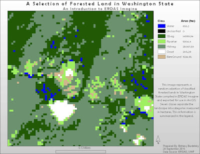
      This third exercise produces the sole cartographic output of the module. To complete this portion I used a classified raster image of Washington State and randomly chose a section (using the Inquire Box tool) to analyze. I also added an Area column to the attribute table. This area data was then incorporated into the legend made in ArcGIS. Imagine has some tricky aspects to it but the layout somewhat resembles that of the GUI of ArcMap. Thus, some tasks seemed intuitive (like right clicking a layer in the Contents panel and editing the attribute table). The Help for this program is also similar to ArcGIS and easy to navigate.
     I included my map below showing the random subset of forest land I selected. The legend shows the seven raster classifications with their concomitant areas in hectares.  
Map 1: A Map Exercise Using a Classified Forest Land Raster of Washington State.

Tuesday, September 22, 2015

Remote Sensing: Module 4 - Ground Truthing and Accuracy Assessment

     I recently attended a workshop on non-destructive means of archaeological survey. We discussed photogrammetry, magnetometry, photogrammetry, and LIDAR, among other things (like soil resistance). In all of these methodology discussions, the researchers drove home the point of ground truthing. This can be a challenge if the area in question is truly remote. Or, as a distance learning student for instance, I cannot actually visit the sites we use in our lab exercises. For situations like this it is necessary to use high resolution (at least higher than the original imagery) imagery to assess the accuracy of land use and land cover classifications. For this course, we use Google Maps to examine the accuracy of the classification exercise performed the previous week.
     There are several ways to design a ground truthing/accuracy assessment survey. The method chosen is a function of available resources (time, man power, budget). I chose a stratified random sampling method wherein which I chose a random point location in the various classification groups. I tried to create a representative sample with at least a single random observation in each category. The random points were checked against Google Maps street views or for areas where there is no street view zooming in as close as possible.
     Typically an error matrix is generating to examine overall accuracy, user accuracy (commission error), and producer's accuracy (omission error). For this assignment we were only asked to calculate the overall accuracy (percentage of correct classifications). Below is the map deliverable showing the overall accuracy percentage and the points used for accuracy assessment. I had the highest success in identifying residential areas and the lowest success at classifying vegetation (time for more hikes!). I also experienced some confusion between commercial and industrial. This exercise was incredibly helpful and addicting. It was hard for me to not spend too much time on every part of the map. The best feeling for me was starting to familiarize myself with Pascagoula. I was getting to the point where I could orient myself by "landmark" shapes of roofs, water towers, and schools.


Map 1: Land Use/Land Classification Ground Truthing and Accuracy Exercise 
If I ever find myself in Mississippi, I may have to make my way to Pascagoula just to ground truth my virtual ground truthing.

Monday, September 14, 2015

Remote Sensing: Module 3 - Land Use Land Cover Classification

Introduction to land use versus land cover

     The focus of the project this week is to identify and classify different land uses and land cover types. This exercise builds upon last week's work with recognition elements. It provides an introduction to another use of aerial photography: assessing natural and urban resources. There are several different classification systems and their usefulness depends upon the scale of the research question or goal of the project. This exercise referenced the USGS Standard Land Use/Land Cover Classification System up to Level II (and for a few instances, Level III).
     Tasks for this lab included deciding upon a scale to use,  generating a visual standard using recognition elements (to ensure uniformity and consistency), and digitizing features by use or cover type up to Level II classifications. [A more practiced eye will no doubt find error in my classifications but bear in mind that we were only asked to spend up to 4 hours as we will be revisiting this map in a later exercise.]
     The map deliverable is shown below. This area (Pascagoula, MS) is largely dominated by urban/built up land and to a lesser extent water with forest land. I was able to identify commercial areas, industrial areas, main roads, and public/private service areas (like schools, cemeteries). I used the same ArcGIS tools as last week to digitize these features and modify their attributes in the attribute table. It was easy to get lost in this assignment. Once you start to really recognize features it became hard not to classify every minute change in land use/land cover.
Map 1: Land Use/Land Cover Classification Exercise  
As a personal aside, I flew back from Washington earlier this week and was able to get live practice at identifying land use and land cover. I played a sort of I Spy and saw agricultural areas, pastoral land, small towns, the airport (obviously), and mountain ranges to name a few things. At any rate, I had a GIS/carto nerd moment.  

Tuesday, September 8, 2015

Remote Sensing: Module 2 - Interpreting Aerial Photography

     This module introduces aerial imagery interpretation. There are several elements of interpretation that help in determining what features are in aerial imagery. Tone, texture, size, and shape are among the basic elements while pattern, shadow, and association are more complex methods of interpretation. Independently and in concert these elements help in the analysis of an image.
     Three exercises in this lab aimed at practicing aerial image interpretation. The first exercise deals with the basic elements of interpretation. The second involves slightly more advanced elements such as pattern and association. The third exercise has no map output but involved examining the color of features in true color imagery (colors we can see) versus false color (other wavelengths). What follows is a more detailed discussion of each exercise and the maps created as a result. 

­Exercise 1
     Tone and texture in this exercise are identified and classified based upon increasing tonal values (very light to very dark) and a range of textures (from very fine to very coarse). Identifying tone is intuitive as the lightest and darkest portions of the image are easily identified (see the screenshot below). To aid in assessing the tone differences I used a grey scale. Texture, however, is not as straightforward. While I felt that I appropriately classified texture, another image analyst may feel what I designated as mottled is actually coarse. It seems more subjective than identifying tone. Below is the map I generated showing areas classified within a range of textures and tones. Five areas for each category are included. For tones, the classes are very light, light, medium, dark, very dark. For texture, the classes are very fine, fine, mottled, coarse, and very coarse.   

Exercise Map Product - Tone and Texture
This map shows various regions highlighted and classified by tone and texture.
Tone classifications range from very light to very dark while texture ranges from very fine to very coarse.
Exercise 2
     In this exercise the elements shape, size, shadow, pattern, and association are used to identify various features in this image. Three features are identified in each one of these categories with association being the exception with only two features. In the shape category, I identified a body of water, a road, and a swimming pool (difficult to see in this scaled down map). Each of these features have a distinct shape and size that allowed me to identify them. The swimming pool, for instance, is uniquely shaped and relatively small when compared to the other water features in the image (and also by association, near a residential area). Using their shadows I was able to identify a sign post, pier, and water tower (also a unique shape). Pattern is one of the higher order visual elements and I used different scales to determine the patterns of various features. When the image is at full extent, the coastal vegetation and residential areas are readily apparent but the parking lot looks like an indistinct, grey rectangle-like area. When that area is magnified the white, ordered outlines of the individual parking spots become visible and therefore easier to analyze. The last identification category is association. These features are identified by their context. For instance, I identified what looks like a motel based upon its shape and surrounding features (like signage, a small swimming pool between two mirrored buildings). The beach is also obvious based on its association and proximity with the ocean, pier, coastal vegetation, and strip of buildings lining it.
     The final output is seen in the screenshot below. Each feature is marked by a colored symbol that is representative of the identification element used.   
 
Exercise Map Product - Interpretive Elements
This map displays features identified by shape/size, shadow, pattern, and association
(combining multiple factors to come to an interpretive conclusion). 
Exercise 3
     For this portion of the lab, I looked at a true color image and compared features identified in that image against those same features in a false color version of the image. The goal is to become acquainted with viewing the world in alternative wavelengths/colors. As an example, the true color of vegetation is green but in a false color infrared image (where red light is green, green light is blue, and near infrared is red) those same plants will display in red. This is a function of the type of light that plants reflect (near infrared and green) and absorb (red). It is fun to view the world in alternative color schemes and also incredibly informative. In the plant example above, the redder the vegetation typically the healthier it is. There is much information to be gathered by examining alternative spatial resolutions.  

Map Composition
     I used the Draw tools to create polygons and point locations in their respective exercises. The Editor tool was used to modify the attribute tables of the layers created by using the Draw tool (converting drawings to graphics and saving as .shp files).