This week, and next, the lab exercise examines the
characteristics of map projections. The purpose of this lab is to examine (both
visually and numerically) a geographic area (in this instance, Florida)
transformed by three different projections. To help understand how data is
altered by a particular projection, area information for select regions are
compared. The result of this exercise is a map that displays the state of
Florida in three different projections and includes comparative data for the
areas of select counties.
Three projections are used in this
exercise. Albers Conical Equal Area is the native projection of the original
shapefile. Universal Transverse Mercator and State Plane North are the other
projections used for comparison. I learned how to use the Project tool to alter
the projection coordinate system of a layer and also how to select a geographic
transformation to go from one geographic coordinate system to another. The lab
also reinforces how to select features (by way of the attribute table) and
generate a new shapefile from those selections. Below you can see the map I
produced for this exercise. The description of the map follows the map
image.
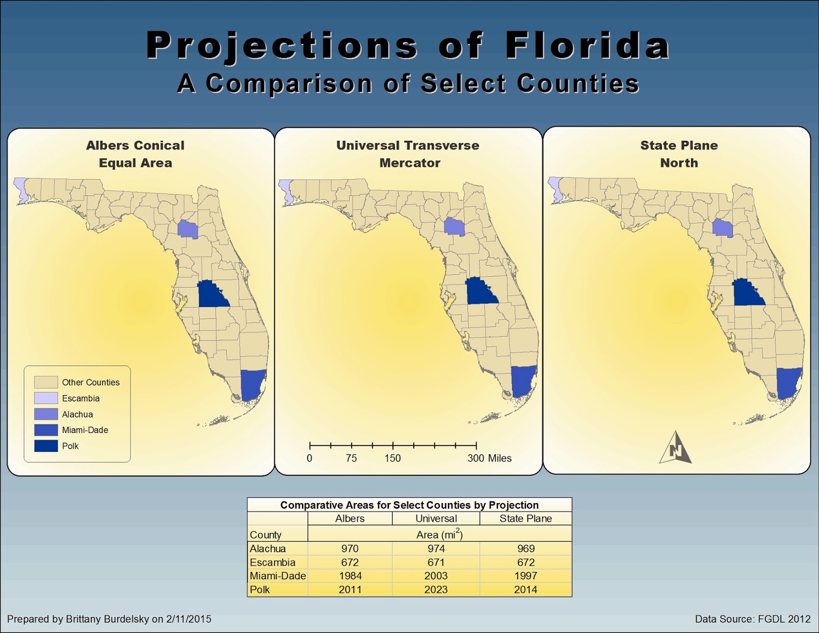 |
A map displaying Florida as it appears in three different projections.
Areas of select counties are summarized in a table to aid in
understanding how a particular projection alters data. |
My
map shows the state of Florida in three different projections. Each map has the
same counties highlighted – Alachua, Escambia, Miami-Dade, and Polk. A table of
comparative areas is provided to show how data is altered by a given projection.
I used a gradient fill for the main background to help create a proper
figure-ground relationship. This helps to highlight the three maps of Florida.
To maintain a design balance, gradients are also used in the Florida maps and
accompanying table. I used blues, yellows, and tan to create a color theme and
unify the visual input. I chose to use a single legend as I thought this would
keep the map from becoming cluttered. I represented each county with unique color
values through a color ramp. The lightest shade of blue corresponds to the
county with the smallest area (as noted in the table) and as the blues become
darker the areas represented become larger. I chose not to include area information within the legend as I would have had to include a different legend for
each map and again, I wanted to keep it simplistic. This is ultimately an esthetic choice since some map users may find the map table off putting and
prefer multiple legends.
No comments:
Post a Comment