Showing posts with label Cartographic Skills. Show all posts

Wednesday, April 29, 2015

Cartography: Final Project - Thematic Mapping of Two Sets of Data


 Map Content   
     This is the last project for this course. The culmination of this project is a single map displaying two datasets. As a final, it tests our ability to design and implement cartographic analyses independently while integrating skills learned throughout the semester. We were given the choice of two data sources (either SAT or ACT testing data), each with two sets of data to map. I chose to use the testing data published by ACT, Inc. I mapped average test score and percentages of graduates tested, by state.
     I used Excel to create a table that could be subsequently imported into ArcMap and joined to the basemap data. I analyzed the data in Excel to see if it was normally distributed. It turns out that neither dataset is normal. (This can be attributed to the fact that in some states taking this test was a requirement while in other states participation is voluntary. Participation in turn affects the average score since more students [of varying aptitudes] are taking the exams in the mandatory states the average score is representative of a broader student base). This is important when considering how to classify and portray your data. After this preliminary data analysis, I worked on preparing my basemap. The basemap data comes from the US Census Bureau and lack a projection. I used Albers Equal Area Conic as it is appropriate for this landmass and the preservation of area (important for preserving the enumeration unit in choropleth maps which is how I wanted to map part of the data).     
     Perhaps the data could have been better represented in a different way but I intuitively leaned toward a chorpoleth basemap and some sort of proportional or graduation symbology. I decided to map the percentage data on a choropleth map while representing the average score with graduated symbols. Since the data is reported by state that caused a light bulb in my head to go off at the thought of enumeration units (states) which brought me to choropleths and data classification. Some classification methods are better at taking the data distribution into consideration (natural breaks, optimal) while others are not so good (equal interval, quantile). I used classification methods in the latter category because they ultimately provided a better visual representation of the data. For the choropleth data: when I experimented with natural breaks and equal interval (I decided against using standard deviation because it is not as easy for a map user to intuit) with 3-7 classes, most of the country ended up being represented by a single class/color. This is largely due to the fact that a substantial proportion of the country (roughly half) had greater than 70% participation. Since the quantile method places an equal number of observations into each category, a greater distinction between classes emerged and I found that 7 classes nicely represented that data. Additionally, the median of the data will fall in the middle class in a quantile classification using an odd number of classes. For the average score data, I used the equal interval method with 3 classes. The scores are tightly clustered on the number line so I thought the range of data was better served by a few classes that were easily distinguishable and interpreted.  

Map Design     
     At first I used the color ramp and symbolization choices found in ArcMap to asses and plan the overall design of my map. I chose, however, to use CorelDraw x7 to compose the final map. Using CorelDraw allowed me to customize and fine tune my map in greater detail than could be done in ArcMap. I used Color Brewer 2.0 to chose a color ramp. I chose a multi-hued, sequential color ramp that allows the map user to easily distinguish between classes (in this case low to high participation percentages). I went with circular graduated symbols to represent the average score data and gave the symbols a gradient fill to make them look spherical (bringing them off of the page). I tried to design a custom symbol but it was not as easy to decipher, confused the pattern in the data, and looked less cohesive than the circles. (Thus, I placed my custom pictograph as the title border so it felt like my efforts were not in vain). I utilized drop shadows extensively to create figure-ground contrast between the elements of my map and sized the contiguous US as large as possible (while still leaving room for other map elements). You can see my map below and I hope that you find it pleasing to the eye, understandable, and informative.
A map of the percentage participation and average scores achieved
by US high school graduates on the ACT for the year 2013. 
     I learned so much from this course. I look at maps with a much more discerning eye and deeper level of understanding. I tend to see a map almost daily by way of news or social media and I appreciate them much more now that I have begun honing my own cartographic skills. Thank you for visiting my blog and participating in my journey as a cartographer. I have a new way to communicate information and I plan to make thorough use of it throughout my career.

Friday, April 10, 2015

Cartography: Module 12 - Google Earth

     Google Earth! Fun and practical. This week I revisited a previous map to practice importing data into Google Earth. Both maps made in ArcMap and individual vector shape files can be converted into KML files (using tools in the Conversion section of ArcToolbox) for use in any client that can read this file type. For this lab, we used Google Earth but there are other options such as ArcGlobe. It is possible to edit some of the features of your imported data. Color, style, and the altitude of your data can all be modified. Some features, however, cannot be altered. The legend imported with map data is unalterable. Only its position can be customized.
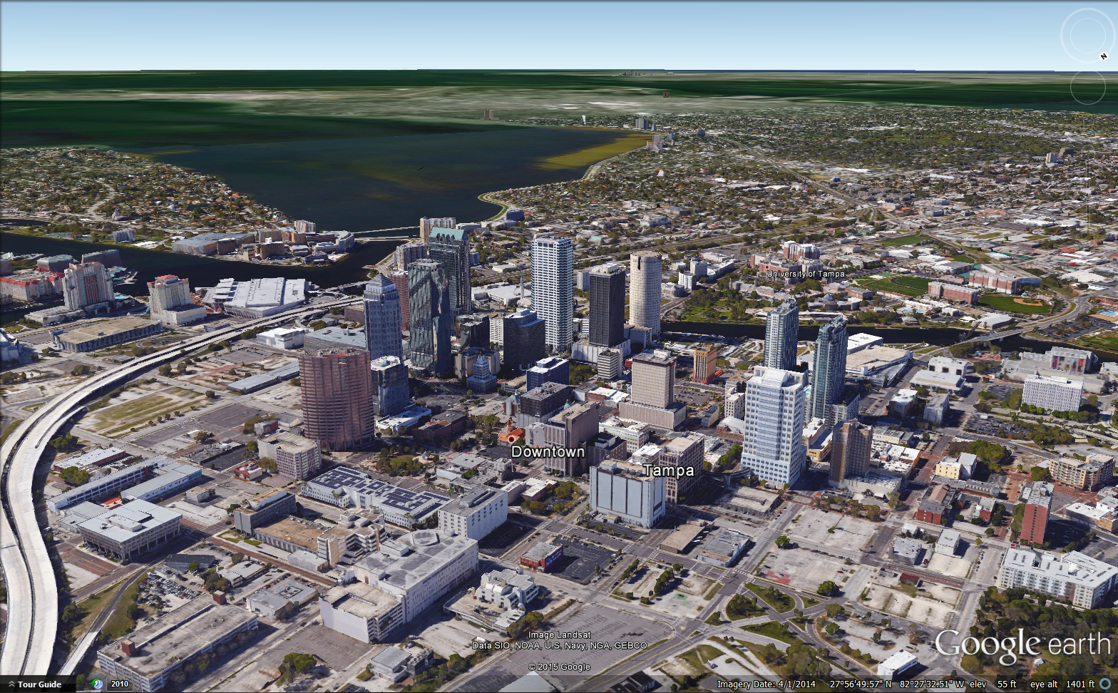
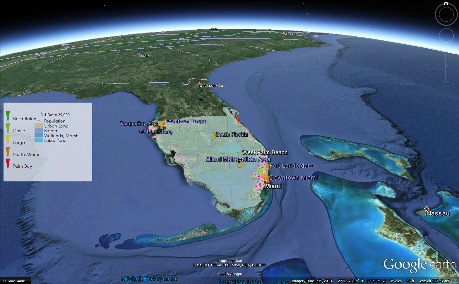
     You can also create a tour of various locations using the Google Earth's 'Record a Tour' tool and I did just that for certain locations in South Florida. Below I included two screenshots from my adventures in Google Earth. The first is a view of downtown Tampa which is rife with 3D imagery. Other locations in South Florida do not possess nearly as much 3D information. The second screenshot is a picture of my dot map displayed over a 3D view of South Florida.

A view of downtown Tampa as seen in the tour I created using Google Earth. 
My dot map from Module 10 (converted to a KML file via ArcMap) displayed on top of a 3D view of South Florida. 

Friday, April 3, 2015

Cartography: Module 11 – 3D Mapping

     This week lab focused on 3D data and visualization. As part of the lab, I completed an Esri virtual training course called, “3D Visualization Techniques Using ArcGIS.” This course walked through techniques for defining base heights for various layers, how to enhance 3D views with vertical exaggeration and illumination, and how to extrude various types of data (like buildings, wells, or parcels). Additionally, I practiced converting 2D data into 3D data and then exporting that 3D data for viewing in Google Earth. Exercises were performed using the 3D Analyst extension in ArcGIS/ArcScene. 

Screenshot of the extrusion exercise from an Esri virtual course in 3D visualization.
It shows two layers that have been extruded, one positively and one negatively. 
     3D mapping has a multitude of applications from simulation to marketing. It is possible to gain a better understanding of the impact of a natural disaster by determining at risk areas for particular scenarios viewed in an immersive way. It can also be of great use to those in real estate as it gives the realtor the ability to show their client an line-of-sight visualization for their property. Urban planning, environmental impact concerns, the possibilities for 3D mapping are expansive.      
     This Esri video provides a great synopsis of 3D Cartography and this Esri white paper also helped me understand what analyses 3D mapping is capable of performing. While 3D data is immersive and often impressive there are some downsides. Both the video and the white paper mention the pros and cons so I will briefly touch on them.
     While a 3D world immediately draws the user in, it can be difficult to navigate and it is easy to get disoriented. However, this type of map interface is rich with visual information that cannot be delivered in the 2D format. For instance, the ability to show vertical information (a z element) in a 3D world can help the user understand exactly how a building can shade a region, if a building possesses enough exposure to the sun to make use of solar panels. In terms of parcels, vertical height can convey all sorts of parcel data (like varying property values). That brings us to intuitive symbology. In a 2D map, there is a necessary reliance upon a legend which is not as necessary in a 3D environment. 3D mapping does require a computer that is capable of performing graphically intensive tasks. That can be expensive and some cartographers may need training so time and cost are  additional concerns.
     I particularly enjoyed this module. I did thesis work using 3D images of anthropoid skulls which can be considered maps of the face. I spent many hours using 3D imaging software so I felt comfortable working with the 3D visualization techniques I used for mapping. I am looking forward to making 3D maps for years to come.
     

Friday, March 27, 2015

Cartography: Module 10 – Dot Density Mapping

     The last couple of weeks have focused on thematic mapping. Dot density mapping is yet another thematic mapping type and was explored in this week’s assignment. Dot density maps are used when the data is conceptual (raw totals) and is not uniformly distributed within the enumeration unit. The dot is then representative of a particular value and placed where that phenomenon is likely to occur. For instance, a dot can represent a given number of individuals (e.g. 1 dot = 10,000) and placed in a populated region (as opposed to an area that is unlikely to be populated).
     These maps are advantageous in that they are easy to interpret and can convey variations in large quantities of data. It is also easy for the user to recreate the original data by simply counting the dots (unless the map is dense or poorly designed). Dot maps take into account ancillary information thus ensuring dot placement in reasonable, logical areas. They are not without issue as there is a human tendency to underestimate density which may affect the map user’s ability to draw the intended conclusion.
    This week’s map is a population density map of South Florida. It was created entirely within ArcMap. The Symbology tab of the Layer Properties contains all of the options for modification of the dot size, value, and color choice. I experimented with combinations of dot size and value until I landed on I choice I felt appropriately represented the data without too many dots converging in densely populated areas. Masking, also found in the Symbology tab (by way of the Properties button once in the Dot Density option), allowed for placement of dots only within urban areas.

A map of the population density of South Florida as depicted through the use of dots.
Each dot represent 25,000. A handful of cities are included to provide reference. 


     My map displays the population density of South Florida with one dot representing 25,000 people. I colored them a bright pink so they would stand out from the other features of the map. Five cities are included to provide a geographic reference. Water features are categorized by type and urban areas are provided for added context. County boundaries are not included to reduce visual clutter and focus the user’s attention on population clusters. I particularly enjoyed this week's assignment as I got to map an area I am familiar with. I am originally from the Miami/Fort Lauderdale area which is chock-full of people (not to age myself, but a while back I went to high school with about 5,000 other students). It is not surprising that the dot map is most dense in this area. 

Friday, March 20, 2015

Cartography: Module 9 – Flow Line Mapping

     This week continues to examine thematic mapping by way of the flow line map. Flow maps illustrate the movement of phenomena between various locations. The widths of the flow lines are proportional to the value of the data they represent. Typically these maps are used to depict the flow of people or commodities (distributive flow maps) but they can also be used to map networks (network flow maps), radial phenomena (like migration – radial flow maps), continuous phenomena (continuous flow maps), and other information (like telecommunications). This map includes another thematic map type – the choropleth – as well.
     I made a distributive flow map of immigration to the United States by region (continent) from a base map provided as lab content. My map was entirely designed and edited in CorelDraw. The flow lines are of proportional widths to the data. The thicknesses were calculated using a specific formula entered into Excel. I used these calculated values to manually generate flow line width (within the Object Properties tool of Corel).


A distributive flow line map depicting immigration
from continental regions to the United States. 
Design Considerations
     The drop shadow and transparency were the main effect tools used. In tandem, these tools helped the flow lines lift off the page without obscuring geographic information. To simplify the map I placed the name of the immigration region within its flow line. Oceania and the Unknown region had such small flow lines that I opted for a placement above the flow line (whilst trying to keep typography guidelines in mind). The continents are somewhat transparent to create a figure-ground relationship with the choropleth map of the United States (one in which the choropleth becomes the central focus). 
     A contiguous legend is included for the choropleth map and the number of immigrants from each region is represented by its own legend of sorts. I used arrows of the same color as the region they represent to display the raw immigration data. The arrows are of decreasing length from the most immigration for a region (Asia) to the least immigration (Unknown). Here, the drop shadow is used to emphasize this information. 
     The maps are not to scale although attention was paid to keeping them in correct proportions (by using the Shift key while resizing). The projections of both the continents and the United States are also noted. Again, I employed the drop shadow tool for the title. As the map contains a lot of information, I did not want the title to be drowned out. The use of the drop shadow helped to make the title noticeable while not overburdening or detracting from the map.  


Friday, March 6, 2015

Cartography: Module 8 - Isarithmic Mapping

     Isarithmic maps map continuous phenomena, like precipitation. This week the assignment was to produce such a map. The aim was to map precipitation data using two different manners of symbolization, continuous tone and hypsometric tints. Contour lines were then added to a map of our choice. The exercises were carried out entirely in ArcMap. Symbolizing raster data was necessarily introduced as well as the Spatial Analyst tool, Int. My two maps are found below. The first map is the continuous tone map and the second map is the hypsometric tints map. Each map displays a short description of the interpolation method used -- PRISM. As a brief overview, PRISM (Parameter-elevation Relationships on Independent Slopes Model) is an interpolation method that incorporates elevation, other physiographic data, and proximity information when deriving a value for a given pixel (using a climate-elevation regression function). It was a method developed by Chris Daly in 1991 while a Ph.D. student at Oregon State University and serves as a way to mimic the choices climatologists made when deriving maps before digitization.  
     The first map uses continuous tones and contour lines to depict average annual rainfall over several decades for the state of Washington. This symbolization is applied by manipulating the settings in the symbology tab of the layer properties. The standard precipitation color ramp is used. Contour lines were added with the Contour List tool accessed through the Spatial Anlayst toolbox. Contours are set at predetermined values.


An isarithmic map displaying precipitation data symbolized in continuous tones.
A short description of PRISM interpolation is also included. 
      The second map uses hypsometric tinting without contour lines to depict the same precipitation information. This symbolization required an extra processing step before tinting could be applied. I used the Int (Spatial Analyst Tool) to convert the raster values from fractional to whole numbers. This helps to create distinct contours using the new whole number values. Again, from the symbology tab (layer properties) I applied a classification to assign colors to ranges of values. I used a manual classification scheme with 10 classes and the precipitation color ramp. Hillshade effects were used in both maps.

An isarithmic map displaying precipitation data symbolized in hypsometric tints.
A short description of PRISM interpolation is also included. 

Friday, February 27, 2015

Cartography: Module 7 – Choropleth and Proportional Symbol Mapping

     The aim of this laboratory exercise is to practice mapping a phenomenon using choropleth maps and subsequently symbolizing data using proportional symbols (in either a graduated or proportional manner). Choropleth maps are ideal for mapping a phenomenon that is uniform over an enumeration unit and that changes at an enumeration boundary. The data for this type of map must be standardized and can either be classed or unclassed. A color scheme is also employed in these types of maps. For the purposes of this lab, a sequential color scheme is used in conjunction with classed data. Three choropleth maps were created to represent several population phenomena for Europe. To practice with proportional symbols, wine consumption is also mapped.
     I completed the majority of the lab in ArcMap. I opted to make a custom symbol to represent wine consumption and designed this symbol in CorelDraw 7. I exported my symbol in a format that ArcMap could utilize (a .png image file and used RGB color settings) and imported that symbol using the Customize options within ArcMap.

A map displaying various choropleth maps for European
demographic data in addition to per capita wine consumption. 

     My map displays three different choropleth maps for Europe. Female and male population percentages are shown in the two smaller maps while the larger map shows population density and wine consumption per capita. The female and male population percentage maps employ a manual classification system with a pinkish-reddish color ramp. The manual classification scheme for both maps is based upon the natural breaks (Jenks) classification settings (with five classes). I adjusted the first class to include more data. That is, there were several countries that did not report their male and female population data. Thus, the first class initially included only those values reported as 0 (four countries). I thought the data was represented well when that first class was expanded. The same classification method is used for the female and male maps to make their comparisons equivalent and trend comparisons easier.
     Population density, in the larger map, is represented with a color ramp of bluish-green hues and a manual classification scheme. The classification is based upon the quantile method. The other classification schemes (natural breaks, equal area, and standard deviation) did not represent the data well. The manner in which the density data is distributed is such that most of the observations were included in the first class of either the natural breaks or equal area methods (and were within one standard deviation). This meant that one color (the single class containing the majority of the data) covered the majority of the map. As the quantile method puts an equal number of observations within each class, it lent itself better to this particular distribution. I then altered the upper limits of each class boundary slightly causing ArcMap to define my scheme as manual. I generated a unique symbol for wine consumption, an amphora, then imported this symbol into ArcMap. I chose graduated symbols over proportional symbols since the scale of the map is small. The proportional symbols obscured the smaller countries and while it may be a more accurate way of displaying data (does not class data into a range with an associated symbol like graduated symbology) it concealed too much. In  addition, I angled the symbols slightly to reduce some of the shrouding.
     Each map has an associated legend which display the color schemes as a contiguous unit. The graduated symbol legend is arranged with the smallest symbol at the top and the largest symbol at the bottom. A nested legend did not seem appropriate for pictographic symbols. A scale for each map is included as well as the projection used. For fun I am including iterations of the amphorae I attempted to use as well as the symbol I ultimately used.

The first amphora. The shading and lack
of outline made this difficult to use in ArcMap
The next attempt at symbolization.
The color choice was better but the lack
of an outline was still an issue.
Also, the handles on the side are too complex.  
Final symbol style.
The outline and color alterations
help the symbol stand out on the map.

Friday, February 20, 2015

Cartography - Module 6 -- Data Classification

     There are various was to classify and display data on your map. This week the lab assignment focused on methods of data classification. In particular, it reviewed natural breaks, equal interval, quantile, and standard deviation methods. The result is a map displaying these four classification methods for a given dataset. I will briefly discuss each classification method and then my map.
     Without going into too much detail, each method has their advantages and disadvantages. They define their classes differently and thus display data differently. The equal interval method generates classes that have equal ranges while the quantiles method divides the data into classes with equal numbers of observations. Thus, for quantiles, the classes have different ranges. Likewise, the natural breaks method has class ranges that differ. This method uses algorithms to minimize within class variance but maximize between class variance. The final method, standard deviation, performs exactly as it is named. It separates the data into classes based upon their deviation from the mean.
     The exercise was performed in ArcMap using their classification tools within the layer properties menu. Default settings for all methods were used. Standard deviation classification uses a default seven classes while the remaining methods use five classes.

A map displaying a dataset classified using four different methods --
quantile, natural breaks, equal interval, and standard deviation.
      My map shows four classification methods - quantile, natural breaks, standard deviation, and equal interval - using population percentage data for residents 65 and older living in Escambia County, Florida. I chose similar graded color ramps for the quantile, natural breaks, and equal interval methods and a divergent color ramp for the standard deviation method. The latter color choice is best for standard deviation as it represents those values closest to the mean as a particular color and as you get farther from the mean in one direction or another they have two different color ramps (in this case reds and blues). I created a custom gradient for the background of the entire map and used drop shadows for the individual method maps. Each map method has a title and a legend.

Friday, February 13, 2015

Cartography: Module 5 -- Spatial Statistics


     This week was another foray into the ESRI Virtual Campus. I completed the course, “Exploring Spatial Patterns in Your Data Using ArcGIS.” This course focused on the analysis of data using spatial statistics tools found in the Spatial Statistics Toolbox and the Geostatistical Analysis extension. Upon finishing the course, I passed a quiz and was awarded a certificate. What follows is  a brief discussion of the tools used and a map that shows some of what I did within the course. 
     A visual assessment of mapped data is a preliminary analytical step. You can see spatial patterns in your data or note a lack there of. These visual trends are fine but a more in depth evaluation of the data is needed. Spatial statistics allow you to examine the characteristics of your data and leads to a richer analysis than can be provided from a visual perusal. For instance, you may not be able to spot an outlier or if that outlier is affecting your data in any way. With the spatial statistics tools provided in ArcMap you can find the median center, mean center, and directional distribution of the data. These tools are found in the Spatial Statistics Toolbox. To take the analysis further you can use the tools located in the Geostatistical Analyst extension. This toolset will display your histogram, QQ plot, semivariogram, Voronoi map, and the global trends within the data. These tools will help you discover if your data is normally distributed, their frequency and variation, and the presence of outliers. In addition, you can see a 3D trend analysis (that you can rotate in real time...pretty neat) and if your data is spatially autocorrelated. 
     The map I am displaying is a result of the first exercise in the course. The goal of the exercise is to examine the spatial distribution of data. For this exercise, I examined weather monitoring stations in western and central Europe. The mean center, median center, and directional distribution ellipse are all displayed. The mean center, represented by the purple diamond, is the average location of the dataset. From this calculation we can see that while there seem to be some clusters of weather stations, there is enough of a dispersion to put the median roughly in the center of western and central Europe. The median center, represented by the orange cross, is the middle value of all the locations. The median and mean centers are close but indicate that the data impact them differently. The directional distribution runs east to west indicating that more of the stations are distributed in this direction than the are to distributed north to south. 
     As far as design, the map example provided is very busy and full of information. I placed the legend in an area that seemed to be less crowded and would not hide any information. I also tried to place the north arrow and authorship in uncluttered areas. The source information has some overlay issues but it is embedded in the layer. Attempts to alter the citations were not allowed by the permissions set on the layer. I made the distributed information take up as much of the map as possible without losing geographic context. I also designed thematic symbols to be visually weighted. 
This is a map displaying the data examined and analyzed as part of
an ESRI virtual training course in spatial statistics. It shows western and central Europe
and the location of weather monitoring stations throughout the region. The mean center,
median center, and directional distribution ellipse are also displayed. 


Wednesday, February 4, 2015

Cartography: Module 4 -- Map Elements and Typography

     This week we further explored map design by practicing typography. The assignment was to place various labels around Marathon Key, Florida. Some of the labels presented challenges that required decisions to be made about placement. That is, there are optimal places for labels to go when they are to accompany a symbol. With this in mind, the small area of the land mass of Marathon required me to make some decisions and bend some cartographic typography rules. There are two labels, one for a key (Duck Key) and a country club (Sombrero Country Club) , that overlay the border of the key with the ocean. I chose to place them here because neither a mask (either around the letters or as a text fill background) nor a leading line looked proper. In the case of the text mask, the size of the type was too small for it to even be made out and created more confusion than it was worth. In creating a background fill for the text it obscured the geographic features even more than leaving the plain text. I thought to include leader lines but they looked distracting and out of place. I tried to keep with the general pattern of the rest of the labels. Thus, I chose to keep their placement despite their overlap and slight clarity issues (technically, overprinting). I feel the labels look much more uniform and harmonious despite some overprinting.
     When labeling the water features I used italics and colored the text blue to easily differentiate it from the other labels. For two of the water features I broke the general rule to keep type horizontal. In the case of Boot Key Harbor (southwestern portion of the map), it is such a small area that I decided to follow the curve of the water feature with the label. I did the same with Vaca Key Bight to avoid overlap with the country club label. For the key (island) labels I chose to use all uppercase letters to distinguish them as areal entities as opposed to simply place names (like a city or public place).

     I made use of the skills I learned in last week’s cartographic design lab in composing the remaining elements of this assignment. The title and inset balance each other on a diagonal from the top left to the bottom right. This is logical as we not only read left to right but these elements fill the empty space Marathon does not fill. I chose a color scheme that adequately creates contrast and contributes to proper figure-ground relationships. I employed drop shadows and gradient fills to create a visual hierarchy by emphasizing the small geographic area of Marathon and weighting the thematic symbols.

Map of Marthon Key, Florida with particular keys, water features, cities, and facilities noted.
This map helped to hone typographic skills in cartographic design.
The small area of Marathon presented textual design challenges that I had to overcome.
     My map shows Marathon Key, Florida with particular facilities, cities, water features, and keys (islands) noted. It was entirely designed and altered within CorelDraw x7. Essential tools were the Text tool for all of the labeling, various Shape tools for thematic symbols and borders, and grouping objects. I enlarged the area of Marathon by grouping all the curves that comprised it. The map is not to scale and mentioned on the map itself. This re-sizing eventually created an issue when exporting my map. After some head scratching I realized this was due to the fact that the frame of Marathon extended beyond the page dimensions. As a result, it looked like I had a white matte to the right and the left of the map. To fix this I cropped the image in MS Paint. This map was a great exercise for learning to implement the rules of typography as they apply to cartographic design.  

Thursday, January 29, 2015

Cartography: Module 3 – Cartographic Design

     This week lab focused on incorporating Gestalt principles in cartographic design. Employing these principles aids in conveying a visual representation of the intellectual hierarchy of a map. To that end I graphically emphasized thematic symbols while deemphasizing less important information. I tried to create contrast, a sense of balance, and an effective figure-ground relationship.
     I created my map in ArcMap using the in-program design tools. I practiced using the clipping tool and generating a new layer (using select data from a larger data set). I also explored the sizing of thematic elements by way of a data layer’s symbology properties. I also toyed with typography and some of the more advanced (that is, not default) settings like splined text. I also had to move the various layers around to make sure they displayed properly. Of all of the design elements, I feel I spent the most time on color. I went through several iterations of color choice until I landed on the soft purples.
A map of the public schools located within Ward 7 of the District of Columbia. 
      My map highlights the primary and secondary schools within Ward 7 of Washington D.C. The schools are symbolized the same but sized differently. Primary schools are sized the smallest and high schools the largest. Seven neighborhoods are noted along with the presence of local roads, parks and water resources. Highways and interstates are also included. Like the school symbology, the highways and interstates are colored similarly but weighted differently (with interstates being the thickest lines and state highways the thinnest). I established a figure-ground relationship by using a pale purple for Ward 7 and a darker purple for the surrounding DC area. In addition, I chose a darker red for the highways and pale grey for the roads within Ward 7. Contrast is created by variably sizing the thematic elements and by using a color scheme that visually differentiates the map elements. I attempted to balance the elements of the map by opposing them in opposite corners of the map. The inset map takes up some of the empty space created by the greater DC area while the legend, scale, and north arrow oppose it diagonally. I also tried to position Ward 7’s perimeter as centered as possible. I went with a portrait orientation for the layout because it created less empty space and allowed me to use a larger scale.

Friday, January 23, 2015

Cartography: Module 2 – Introduction to Cartographic Design

     The aim of the module this week is to work on cartographic design skills. Particularly, I worked on learning basic graphic design skills to edit and embellish my map. The initial map information was loaded into ArcMap (.mxd) and then exported in a format (.eps) to be loaded into CorelDraw 7. Once in CorelDraw, I added all of the essential map elements and more. The title, legend, city text labels, and symbols on the map were all generated. The geographic area of Florida and scale bar were edited in a manner that maintained their accuracy. The ultimate objective was to create a map that represents, and helps develop, my cartographic aesthetic.
     My map shows the state of Florida with its 67 counties, major cities, and water features. I created a symbol for, and labeled, the state capitol. Two other major cities, Tampa and Daytona Beach, are also labeled. The map includes some state symbols. I used more than a few of these in order to fill up some of the empty spaces on the map. In all I included the state flower, bird, animal, marine mammal, and seal. Tools that proved useful were the text tool, shape tools (ellipse, complex star, rectangle), bitmap tools, and most of the tools within an object’s property menu.

     
Map of Florida displaying major cities, water features, and counties. Personalized with
various state symbol imagery and text, point, and legend customization.  
     I thought this exercise was great for "crash coursing" graphic design. It was, at times, overwhelming. There are many ways to customize any element and when you are first learning the lay of the land it is a daunting task. After much experimentation I am feeling like a pro. Of course, I am far from it but I am less intimidated. If you can read a manual or watch a video online, then it can be figured out.

Map imagery sources: orange blossoms, seal, bird, land mammal, marine mammal.

Wednesday, January 14, 2015

Cartographic Skills: Module 1 - Map Critique

This week our lab module focused on critiquing a map using the map design principles established by Edward Tufte and the principles for design created by British Cartographic Society. The following maps were evaluated for quality based on these principles. Each map is accompanied by a short paragraph discussing their design successes or shortcomings.
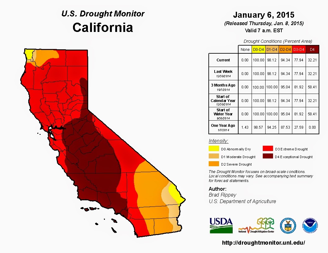
An example of a successful map.
Source.
     This map can be considered well-designed in that it upholds several Tufteisms. Of the ’20 Tufteisms,’ this map follows the requirement that the map not only be well-designed but also that it convey complex ideas clearly and efficiently. In addition, the map also delivers the viewer many ideas (drought conditions are worsening, large areas of California are experiencing terrible drought conditions) in a short amount of time. The map clearly conveys relevant information (percent area experiencing a particular level of drought) and is not filled with clutter or visual noise. It does not take the viewer long to see that drought conditions have become progressively worse over time. The color scheme the author uses evokes the sentiment of alarm in the viewer. Yellow, orange, and red are often used as colors of warning. The viewer can clearly see that large portions of the state are covered in red or deep red which correlate with the severe drought conditions (noted in the table). This shows that the author can engage the viewer’s emotions. The table included displays the underlying statistics of the map and it is also laid out in an easy-to-interpret manner. Should the viewer have any questions, they can easily see authorship and agency associations and thus inquire further.

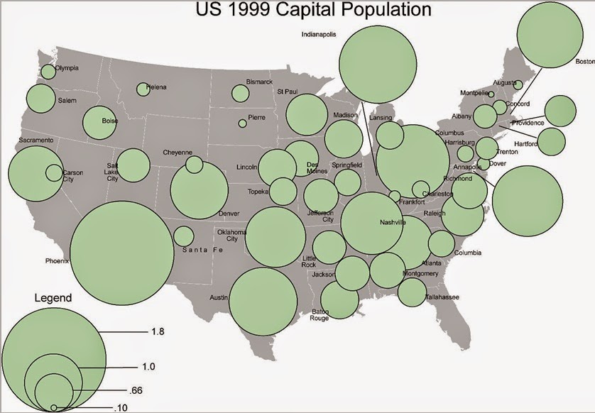
An example of a poor map.
Source: Course lab materials.
From a cursory examination, this map violates several Tufteisms and map design principles. The map does not tell the truth about the data (no units of measure), its labeling system is not clear or thorough (most states are obscured by the “population” circles), and ideas are not conveyed with clarity or efficiency (What about capitol populations?). The concept of the map is not easily grasped. The title is meaningless as it has no context (the map visuals do nothing to illuminate the aim of the map) and does not summarize much for the viewer other than the fact that there are US capitals displayed (sort of – many of their locations are obscured). There is no frame of reference to understand the meaning of the graphics. The circles partially or completely obscure the capital they are representing. The circles sprawl all over the map and ruin any attempt of the viewer at understanding what the map is conveying. The legend data has no units of measure rendering not only the numbers displayed useless but also their graphic representation pointless. The design choices leave the viewer unable to draw any conclusions about the information displayed in the map.  

Sunday, January 11, 2015

Cartographic Skills: Orientation - Short Introduction

Me at Pikes Peak, elevation 14,114 feet. 

Hello and welcome to my GIS blog. My name is Brittany and I am going to briefly introduce myself. I am currently living in Aurora, CO. I have a BS in biology from FSU and a MA in anthropology from FAU. As a graduate student my research focused on the scaling relationships in the facial structure of Paranthropus and other hominins. Other areas of interest are dental anthropology, bioarchaeology, and paleopathology. Lately, I have felt myself being pulled in the direction of archaeology and cultural resource management. Between job applications, volunteer positions, and other groups I am involved with I have noticed an increasing demand for GIS know how and experience. This led me to conclude that a certification was best for my career so here I am. [Also, I really enjoy learning and if I could afford to be a student for the rest of my life then I would.] Upon completion of this certificate program I hope to start working either as a consultant or for any number of government agencies. I cannot wait to translate the knowledge from this and subsequent courses into a full time career. 


Thank you for taking the time to get to know a little bit about me. I invite you to check out my Esri Story Tour for a glimpse into my weekly happenings.