Friday, December 2, 2016

Special Topics: Module 11 - Final Project (Modeling Cave Sites)

     This final project is the culmination of the work we have carried out in the name of GIS for archaeology. We have modeled Scythian landscapes, areas potentially containing shipwrecks, and site probability in an archaeological district. For my final assignment I wanted to model potential areas where ritual cave sites could be located in Greece. As it turns out, my model fails to reject a null hypothesis of random site distribution. My data is not clustered or spatially autocorrelated. This is likely due to a small known sample size and a simplistic model based upon only three explanatory variables (slope, aspect, and elevation). Each map below represents progress in the development of a predictive model.
     Data for this assignment is freely available and was compiled from several sources. Sacred cave data was partially derived from The American School of Classical Studies at Athens. Additional cave sites were compiled from Wikipedia and a caving enthusiast's website. Digital elevation data was derived from ASTER tiles downloaded using USGS's Earth Explorer. (When downloading lots of data be sure to use their handy bulk downloading tool).

Study Area
    The extent of the study area was determined by the cave data. An arbitrary polygon was drawn around a portion of mainland Greece and Crete. The cave data represent multiple periods of ritual use (from Neolithic to Roman). The point locations are also generally approximate and unverified. I used the Mosaic to New Raster tool to stitch all 30+ ASTER tiles together into one raster. I then clipped the raster to the study area polygon. The cave shapefile was a product of the ASCSA data and the other site data. I used an Excel spreadsheet to add XY data and merge it with the ASCA data. Voila! More data (relatively speaking, my sample size went from 10 to 21). 


Map 1. An overview of the study area with a DEM
overlaid atop an Esri imagery base map.
Map 2. An overview of the study area with sacred
cave sites noted. 


Primary Coverages
     Before secondary coverages can be generated, it is necessary to examine patterns in existing data. This helps in deciding weights to assign when data are reclassified. Here we see a slope, aspect, and contour coverage of the study area. Each are derived using the DEM and their respective Spatial Analyst tool (Slope, Aspect, Contour). There were not any obvious patterns in the data particularly concerning aspect. The caves were almost equally distributed between northerly and southerly aspects. Most caves were located between 0 and 600 meters in elevation. They were also predominately located in areas with a slope between 10 and 20 degrees. There were outliers though. The Cave of Zeus was located at a much higher elevation and slope than any of the other caves (only the highest and slopiest for old Z-man). This information was taken into consideration when developing weight classes for data ranges.


Map 3. A slope surface derived from DEM data.
Map 4. An aspect surface generated from a DEM.


Map 5. A map showing contour lines in 300 meter intervals.
Cave sites are shown to demonstrate the process of
noting characteristics of cave sites.


Secondary Coverages
     Once the data have been examined and weights decided upon they are used to develop secondary coverages. This is done using the Reclassify tool in ArcMap. Here we see the results of that process. Each map shows probability represented by three classes. Areas possessing similar characteristics to known sites are symbolized in red denoting a higher probability of finding sites, moderate probability areas are in yellow, and low probability areas are in green. These coverages will then be weighted to develop a predictive model.


Map 7. Slope reclassified. 
Map 6. Aspect reclassified.


Map 8. Elevation reclassified. 

Predictive Model
     These secondary coverages are now ready for use in deriving a predictive model. I generated multiple predictive model outputs using different weights assigned to each secondary coverage using the Weighted Overlay tool. Each model emphasizes one coverage over the others. The exception is Model D which weights each coverage equally. This comparative exercise shows what happens when weights of explanatory variables are altered. When using predictive models to inform survey and archaeological investigations it is important to generate a solid predictive model. These models have common areas of high probability but differences could mean a lot when time and money for a project are of the essence.

Map 9. The predictive models. Each one of these models are the result of assigning different weights to the secondary coverages. Weights assigned are noted beneath each data frame. High probability areas are symbolized in red.
Analyses
     Predictive models cannot be taken at face value. They must be statistically examined. Turns out, when I probed my data it was found wanton (but that doesn't mean it isn't informative). The data is random and not spatially autocorrelated. It overpredicts sites in low elevation areas especially on the smaller islands and Crete. I performed an Ordinary Least Squares regression (in order to perform these analyses I had to generate random non-sites as a proxy for known non-sites in the study area), spatial autocorrelation, and a hot spot analysis. The results of these tests are seen in the final map product for this assignment.

Map 10. OLS, hot spot, and spatial autocorrelation results. 


Thursday, November 10, 2016

Special Topics: Module 9 - Biscayne Shipwrecks (Part 2)

     All that preparation last week set the stage for analysis this week. So we'll dive right in. First, I defined a 300 meter radius surrounding the shipwrecks to examine the benthic environment surrounding each wreck. Then, reclassified rasters were generated for the benthic and bathymetric data. These were used in conjunction to create a simplified weighted overlay/predictive model.
For this analysis, there was not enough data for a linear regression or a statistically meaningful analysis of the shipwrecks (we were working with n = 5) but we had enough data to guide survey efforts.
     As in previous weeks regarding predicitve models, essential tools were the Feature to Raster tool,  Reclassify, and the Weighted overlay tool. As well as the workhorses of geoprocessing: the Buffer and the Clip tool.
     The three map deliverables below each show a different aspect of the analysis. Map 1 is a summary of the benthic characteristics within the study area (300m radius) surrounding each shipwreck. Map 2 shows a comparison of the reclassified data used to derive the predictive model. Map 3 is the predictive model. In Map 2, areas in red denote high probability while those in dark green represent the lowest probability of finding a shipwreck site. The areas in red in Maps 3 are thse areas where the model predicted areas with a high likelihood of containing a shipwreck. That is those areas most resemble the conditions surrounding the known shipwreck sites.

Map 1 shows the benthic environment surrounding the study area of each site.
It also contains an overview of the park.
Map 2 shows the reclassified raster data used in the predictive model.

Map 3 is the end product of our analyses. This is the predictive model
generated by using reclassified benthic and bathymetric data.


Thursday, November 3, 2016

Special Topics: Module 8 - Biscayne Shipwrecks (Part 1)

     Time to sink in (bad joke) to some shipwrecks. That's right. These ships went down near Biscayne Bay, Florida. They don't make jokes about you for nothing Florida. Way to s(t)ink, I kid. I love my home state. This assignment made me feel a twinge of home sickness. Luckily I will be heading that way soon and maybe snorkel this maritime heritage trail.
     This week I explored two websites looking for data to use for this marine archaeology project. The first website provided the historical chart while the latter is where I acquired DEM data for Biscayne National Park. Point data for the heritage trail was provided to us care of UWF as was the benthic data.  Finding the DEM was a bit of a chore as the data I thought I was accessing led to another website/tab several times before I actually reached the data. And, often that data wasn't what I was looking for. Perseverance is the order of the day. Once I downloaded the historical chart I georeferenced it. The DEM/bathymetric data was clipped to a digitized boundary of the park. The data is now prepped for use in the coming weeks.
     The final map deliverable is seen below. It shows the benthic data, historic chart, and DEM data all clipped to the park boundary. The shipwreck locations display in each data frame giving them context in different visualizations within the same space. A short description is also included on the map that briefly discusses the map content.

A map deliverable displaying data for Biscayne National Park, Florida
 prepared for analysis in the coming week. 


Thursday, October 27, 2016

Special Topics: Module 7 - Modeling Scythian Landscapes (Part 3)

     This wraps up our discussion of Scythian landscapes. We prepped data, generated secondary coverages, and this final week we used Ordinary Least Squares (OLS) regression to explore our data.
The first task was to generate non-sites (though this is not an ideal method as it is not ground truthed data). ArcGIS has a nifty tool that generates random points across your data. The Create Random Points (a Data Management tool) accomplishes that end. Once the points were generated they were merged with the Tuekta mounds identified last week. The attribute table was then populated with the reclassified slope, aspect, and elevation numbers from the secondary coverages.
     With the attribute table populated, I ran an OLS linear regression using these sites and 'non-sites.' Turns out the model, as it stands, explains about 74% of variability in the data. (Elevation had the highest coefficient of the three variables.) We also checked the results of the OLS regression against the results of a Spatial Autocorrelation and a Hot Spot Analysis. The results are summarized in the map deliverable. Two data frames display the OLS and Hotspot analyses over a DEM of the study area. The results (a low p-value and a high Z-score confirm the results of the regression - the data is clustered and non-random) of the Spatial Autocorrelation are shown at the bottom of the map. Adding additional variables could improve the predictability of the model, however, these variables are enough to parse the statistics and learn a bit about probing landscape level archaeological data.


Map deliverable showing the results of both the OLS and
hotspot analyses overlaid atop the study area DEM.
The Spatial Autocorrelation results are also shown for reference.


Thursday, October 20, 2016

Special Topics: Module 6 - Modeling Scythian Landscapes (Part 2)

     The week prior focused on data preparation for this lab. This week secondary coverages were generated for slope, aspect, and elevation. In addition, contour lines were also derived from the DEM. The georeferenced image of the mounds was used to generate a shapefile of the point locations of the mounds. This was great practice for identifying archaeological features in the landscape and also to discern any patterns these features may or may not possess.  The general trend seems to be that the mounds are found in areas with low elevation, facing in southerly directions (SE, S, SW), and they lie at slopes between 0 and 10 degrees. Next week, the lab will statistically explore the data and we will 'publish' it.
     The map deliverable below shows the several coverages that were generated along with a shapefile showing the point locations of some of the Tuekta mounds. The coverages were generated just as was done in preparation for the Tangle Lakes project weeks prior.


Thursday, October 13, 2016

Special Topics: Module 5 - Modeling Scythian Landscapes (Part 1)

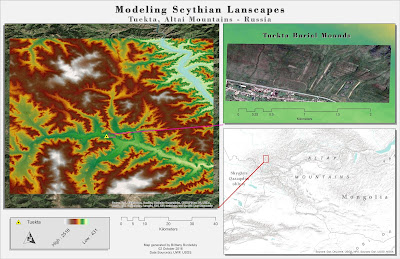
     This module is all about data preparation (for labs in the coming weeks) and starts our foray into landscape archaeology. We walked through gathering data for international landscapes from the USGS Earth Explorer. In particular, locating DEM data for an area in the Altai Mountains of Russia that contains known Scythian mound burials (also known as kurgans). For this exercise we used ASTER derived data. The Mosaic to New Raster tool was used to stitch together four raster datasets and from there we digitized a boundary and clipped the larger DEM down to something more manageable.
     The map deliverable shows the subset of data examined by way of a DEM symbolized with the elevation color ramp. It also highlights the area where the mounds are located with a georeferenced JPG.
This week's deliverable highlighting a region in the
Altai Mountains, Russia that contains burial mounds.


Thursday, October 6, 2016

Special Topics: Module 4 - Predictive Modeling

     Predictive models are another tool in the archaeologists toolbox and this week we ran a simple predictive model for an archaeological district in Alaska. Predictive models can take many factors into account but for the purposes of this lab we used four components/generated surfaces: slope, aspect, elevation, and proximity to water. The Spatial Analyst extension is key in implementing a predictive model in ArcMap, particularly the Reclass, Surface, and Overlay toolsets (for the Weighted Overlay tool).
     While predictive models are great for informing survey decisions and streamlining cultural management processes they're aren't a panacea. They can in no way serve as substitute to boots on the ground, they can merely supplement and inform survey and project planning. There is no model, no matter how thorough, that can say that there are no archaeological materials in an area. These models represent probability and likelihood of the presence of archaeological remains.
     I am currently at the Great Basin Archaeological Conference and one of the presentations I was able to see discussed a predictive model for an area of National Forest that I work in. The model had a greater than 90% ability to predict the known site locations (it was thoroughly cross validated and I have spent the summer collecting data in some of the unsurveyed areas...it will be neat to see if the model predicted a comparable amount of density in that region). That being said, it's those sites that appear in the unlikely areas that become of great interest (in their deviation from a pattern).
     Yes, predictive models do not tell the whole story but they go a long way in helping, in my instance a National Forest, determine how best to allot limited resources (time, money, seasonal employees).
     Below is my map deliverable showing the areas that are likely to contain sites in green. That means their combination of slope, aspect, elevation, and proximity to water are ideal.
Map deliverable displaying the results of a predictive model
run using slope, aspect, elevation, and proximity to water. 


Thursday, September 22, 2016

Special Topics: Module 3 - Finding Maya Pyramids (Part 3)

     This module wraps up our discussion of and practice with locating archaeological data with satellite imagery. Specifically, this week focused on disseminating our results with a wider audience through the publication of layers and maps for use in Google Earth (as it is user friendly and has a wide usership - hah wasn't sure that was a word...).
     Two tools in the Conversion toolbox create file formats (.kml/.kmz) that can be opened in Google Earth. These tools are the Layer to KML and Map to KML. Below is a screenshot of one of the map open in Google Earth. It is quite handy. You can move between the layers of your map to toggle them to display or not. We've used these tools in the program before when we displayed our dot density maps of South Florida for the Cartography course. I also use the Layer to KML tool in work to share non-sensitive data (usually fire related) information within the Forest Service. Putting what you learn to use is always exciting. I am very much looking forward to the next module on predictive models because I am going to using those skills at work too. Fun, fun.

Screen capture of my map product displaying in Google Earth.
The false color (4, 3, 2) composite is showing. Vegetation is in red.


Wednesday, September 14, 2016

Special Topics: Module 2 - Finding Maya Pyramids (Part 2)

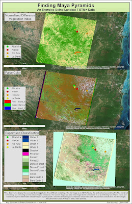
     Last week we used Landsat 7 ETM+ data to examine the vegetated area obscuring the La Danta pyramid and archaeological complex (a Maya site located in Guatemala). Since the location of the complex is known it was used as a control to see if any other areas could be hiding, based on spectral similarities, archaeological structures. First, a new spectral band combinations (new as last week we looked at a false color and natural color composite) and a normalized difference vegetation index (NDVI) image were generated. Once these images were generated, I performed a supervised classification to search for probable site locations to survey.
     I used the NDVI tool in the Image Analysis window to generate the NDVI image. This index is use to determine relative biomass and health of vegetation. Differences in plant growth patterns or in plant health can be used as indicators of the presence of material remains. The NDVI image can help in detecting these differences.
     I used the Composite Band tool again to generate two different band combinations - 7, 5, 4, and 4, 5, 1. The first band combination is ideal for penetrating atmosphere/smoke and highlighting the difference between bare soil and vegetation. The latter band combination is idea in detecting the various stages of plant growth (though precipitation impacts these results).  To my eye, the pyramid was still difficult to discern in all of the images. Thankfully, owing to the known location of La Danta a pyramid training sample can be generated and the results can identify areas of similar spectral characteristics. These locations, once refined and examined further, can narrow down the search area for archaeologists.

Map deliverable for this module. showing three renderings of a Landsat image. 
     The supervised classification was generated with the help of the Image Classification toolbar in ArcMap. The classes I used were dense forest, forest, water, urban, bare earth, cloud, shadow, and the La Danta area for 'pyramid.' Despite many attempts I was unable to go without multiple classes of the same type. That is, when I combined my training samples (for instance, the two bare earth classes) it introduced greater error in the resulting image. My final classification shows some areas where pyramids could potentially be found. I think, in addition to other contextual visual information, the results could help in determining potential areas to survey.


Thursday, September 8, 2016

Special Topics: Module 1 - Finding Maya Pyramids (Part 1)

     This assignment takes me back to the Remote Sensing course but now I get to apply those principles to finding Maya pyramids. Space archaeology, hooray! This first assignment sets the stage for the next two weeks by preparing the data for a supervised classification (next module). We use past (2001) Landsat 7 ETM+ data to examine the location of a known Maya pyramid complex (La Danta, discovered in 2009). Using different band combinations (see below) we looked for any distinguishing characteristics around the pyramid that might help in identifying the locations of other pyramids in the jungle (in the next module).

     My map shows a full extent panchromatic image (band 8, 15m resolution) of the broader area surrounding the pyramid, La Danta (a Maya pyramid). A true color and false color image of the area in the immediate vicinity of the pyramid are shown. The true color (band combination: 3 - visible light [red], 2 - visible light [green], 1 - visible light [blue]) and false color (band combination: 4 - near infrared, 3 - visible light [red], 2 - visible light [green]) images were generated using the Composite Bands tool (Data Management toolbox). Both the contrast and the brightness were altered to enhance the image and the images were pansharpened using the panchromatic band (band 8). The pyramid is difficult to visualize at these band combinations as it was, at the time, obscured by vegetation.

A map showing a full extent panchromatic image of an area of jungle in
 Guatemala containing several Maya pyramid complexes. Two composite
images (one true color, one false color) highlight an area where a pyramid,
La Danta, is obscured by dense vegetation.

Thursday, August 4, 2016

GIS Applications in Archaeology: Final Project

     The last module for this course is the final project. We were given two choices. The first option was to perform a catchment analysis on the Oaxaca Valley data from earlier in the semester (Module 6). The second option was to generate your own research project. While the Oaxaca catchment analysis would have been enlightening, it is South American archaeology. As I currently hold a seasonal position with the Forest Service, I thought it would be more relevant to my career path to choose a North American archaeology topic. With that in mind I decided to look at coastal erosion and archaeology along the coast of Apalachicola. The study area is shown in Map 1 below.
     The aim of my project was to use GIS to generate a list of sites that could potentially be threatened by coastal erosion due to their proximity to stretches of coast that experience high rates of coastal erosion. The Select by Location tool was integral to my analysis. With it I was able to find sites within a certain distance from erosion (distance determined by rates of erosion in each county examined), see Map 2 below. From this set of  sites I was able to identify those that were outside of conservation lands. I think that this makes them more susceptible to the effects of erosion as they may not be monitored as frequently as those that are managed in public land.

Map 1. A map of the study area showing the three Apalachicola
coastal counties analyzed - Gulf, Franklin, and Wakulla.

Map 2. A map showing all of the archaeological sites that lie along areas of the
coast that are impacted by high or very high erosion rates.

Map 3. A map showing protected, conservation lands and those archaeological
sites that lie outside 
I found 15 sites that require monitoring as they lie outside of public land. They are presumably more threatened than those sites that lie within conservation lands (assuming sites in these protected areas are monitored regularly). Fifty two sites in total were identified as being proximal to and likely to be impacted by erosion. Future studies would refine this research and look to generating a cultural resource vulnerability index to sites as was done by Reeder et al (2012).

Links to data sources:
USGS
ARROW
FGDL

Literature Cited
Reeder, Leslie A., Torben C. Rick, and Jon M. Erlandson
     2012 Our disappearing past: A GIS analysis of the vulnerability of coastal archaeological  
         resources in the Santa Barbara Channel Islands. J Coast Conserv 16:187-197

Thursday, July 14, 2016

Remote Sensing in Archaeology: Monk's Mound, Cahokia

Cahokia Mounds
     The Cahokia Mounds are all that remain of a once thriving city in North America located in Collinsville, Illinois. Inhabited between 600 - 1400AD (during the late Woodland/early Mississippian periods), the site at its peak boasted a population of 10,000 to 20,000 people. It originally consisted of more than 100 earthworks and mounds but only about 80 currently remain.
     The cause for the site's eventual abandonment is unknown but it was in decline around a century before Europeans arrived. What was once the largest prehistoric Native American settlement north of Mexico is now situated amidst modern development.
     The mounds are designated a National Historic Landmark and a UNESCO World Heritage site. Monk's Mound is the largest mound in the complex. For this assignment, we performed two different types of raster classification in ArcMap. We visualized Monk's Mound after these classifications to see how they are classified.

Unsupervised Classification
Below is the map end product generated from running an unsupervised classification in ArcMap. There is a fair amount of confusion between the classes (for this assignment we used 8) with vegetation being represented by 5 of the 8 classes. Monk's Mound is classified as urban or bare earth.

A map of an unsupervised classification performed on raster data
acquired from USGS for the Cahokia site in Illinois. 


Supervised Classification
Here is the map end product of running a supervised classification for the same image. Instead of telling the program to derive the classes, samples were used to create a signature file. These signatures were in turn used to classify the raster. In this classification, I attempted to use 6 classes to separate the raster pixels. There is plenty of error in that dark features (like water and shadowed trees) are lumped together. Trees are not captured well either and it the classification makes it seem like there are less than there really are. Here, like the previous unsupervised classification, Monk's Mound is classified as an urban/road feature again.

A supervised classification performed on raster data
acquired from USGS for the Cahokia site in Illinois. 

Monday, July 4, 2016

3D Modeling of Shovel Test Data

     This week's assignment focused on learning how to manipulate archaeological data in ArcScene (a 3D environment). To prepare data for ArcScene, shovel test data was examined in ArcMap. Geological surfaces were rendered/interpolated using the IDW (inverse distance weighted tool). These surface were used to make the map you see below. The shovel test data was also imported into ArcScene and we used the Base Height tab and the Extrusion tab to project the 2D data into 3D space.
A simple map showing three interpolated surfaces derived from shovel test data. 

     Using the Fly tool (link) and Animation tool (link) I created a video that travels through the shovel tests. While not essential to understanding this data it is a neat way to visualize and interact with it. (Bonus: these types of visuals can also be used to enhance a presentation.)


     This assignment brought together several of the skills we have learned throughout the semester and helped prepare us for the final project. As a continuation of this theme, our discussion post focused on the application of 3D technology in archaeology. I mention this because you may have fun exploring some of the sites I found, CyArkMayaArch3D, a Roman statue base, and other tech summary sources. Try to contain your excitement :).


Wednesday, June 29, 2016

Surface Interpolation Techniques - Examining Patterns In Archaeological Data

     This week our lab introduced surface interpolation and kernel densities as a means of examining, analyzing, and interpreting patterns in archaeological data. We used shovel test data and (insert PArt 2 data description) data to practice the application of these techniques. The tools used are all part of the Spatial Analyst extension. I used the kernel density, IDW (Inverse Distance Weighted), kriging, spline, and natural neighbor interpolation tools to see how they each visualize the same dataset. Below is a poster that shows these methods applied to two datasets mentioned above. In addition, here is a helpful link for a discussion of the interpolation tools I noted and that are offered in the Spatial Analyst extension.


A 'poster' showing the various interpolation methods used to examine two sets of data. 

Thursday, June 23, 2016

Digitizing Archaeological Data - Settlement Survey in Oaxaca, Mexico

     For this lab, data from a settlement survey of the Oaxaca Valley in Mexico was provided to us (by way of scanned chapters and appendices) and each student was assigned units of this survey to digitize. The survey provided land cover data in conjunction with occupation/settlement data (determined through analysis of collected artifacts - like pot sherds). All of this information needed to be digitized and overlaid on the georeferenced topographic map.
    Gathering the data was quick since the maps and information were scanned and provided to us. To prepare the imagery for use in ArcMap I copied and pasted the images of "my" maps into paint and edited them to remove extraneous white space. Georeferencing all of the data was time consuming. Additionally, digitizing also took longer than expected.
     At first, the georeferencing part of the lab went smoothly. I georeferenced a grid map of Oaxaca Valley after a good bit of analysis of the modern topography of the valley. The image gets quite pixelated when zooming in so I had to find a balance between scales to guide alignment and referencing. I then georeferenced the images of my unit only to realize that my original topography, in the area of my assigned units, was skewed to the east. I realized that this resulted from my methodology for georeferencing. I went for overall map accuracy while I should have been seeking accuracy in the relatively small area of my units. Thus, I went back to the drawing board and georeferenced the grid map with emphasis on accuracy in my given area. With better accuracy in my region, I felt confident georeferencing all of my unit squares.
     With the data in my maps georeferenced I went ahead and began digitizing my data. Through the course of digitizing I got very comfortable with the Editor toolbar and the Snapping toolbar. Some of the images became skewed after georeferencing making them difficult to interpret (along with their pixelation). Some numbers were illegible so I had to keep the original data handy for reference. [A quick side note, this assignment made me wish for multiple monitors. I think it would have relieved some of the burden of minimizing windows and managing many windows at once.] Once I finished digitizing all of the data and began to compile maps I noticed that I had some errors. For instance, when I placed the occupation data on top of the land cover data there were alignment issues. Hopefully, for learning purposes these errors are not egregious. In a more rigorous situation (work or publications) I would have spent much more time on this lab. As it stands, this assignment took two weeks to finish. I helped a coworker georeference a map from the 1930s and it took about 45 minutes. It was, however, less challenging data and required no digitizing.
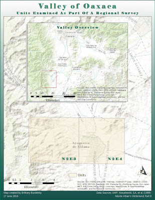
     I provided all the maps I compiled to complete the assignment. One of my units had several maps (unit N2E3A-C) because many time periods were encompassed by the area. I tried to visualize all of the data efficiently hopefully you think so too.
Map 1 - An Overview of Oaxaca Valley
showing the location of my assigned units.


Map 2 - A map showing the same unit split into multiple
occupational periods overlaid upon landcover data. 

Map 3 - A map showing the same unit split into multiple
occupational periods overlaid upon landcover data. 
Map 4 - A map showing an additional unit (adjacent to the one in the previous maps)
overlaid upon landcover data. 


Tuesday, June 7, 2016

Historic Maps - Georeferencing


     This week we continued using historic maps but took it a step further. Instead of being provided with a previously georeferenced map we performed that task ourselves. The data for this assignment came from the David Rumsey Map Collection. Specifically, I used the Geographical Searching with MapRank Search to find an historic map of Macau. The map was authored by William Bligh (1754-1817) and James Cook (1728-1779) and published as part of a collection of maps detailing the explorations undertaken during Cook's voyages. The links provided presents more information about the publication and the men themselves. 

Georeferencing
After acquiring the map it was cropped to eliminate irrelevant portions of the image (like the pages and cover). The newly edited image was imported into ArcMap and georeferenced. The historic map shows a much different landscape than that we see for modern Macau. This made the search for control points a challenge. In addition, the historic map was inaccurate (things seemed to align fairly well vertically but were off horizontally). Some features, however, are still present on both maps, like Illa Verde. At any rate, once I had enough control points (n > 10) and a reasonable RMSE (considering time management on the lab), I used a spline transformation to acquire the georeferenced image you see below. The map deliverable shows the georeferenced historic map (40% transparency) over aerial satellite imagery for Macau, China. 

The map deliverable showing the georeferenced
historic map of Macau displayed atop aerial imagery.
    A quick note, if you have some spare time to peruse old maps then let me recommend the site I referenced earlier. The David Rumsey Map Collection is chalk full of neat ways to visualize historic maps. They have georeferenced historic maps displayed on Google Earth where you can compare historic and modern map images. Additionally, they have a 3D GIS Viewer in which historic maps are combined with DEM from the same area to make a 3D historic image. Tell me that doesn't pique your interest. Explore the rest of the site because I am only touching on a couple of the incredible things you can distract yourself with.

Thursday, June 2, 2016

Historic Maps - Paul Revere


     Archaeologists often deal with historic maps and make use of them in their research. These maps are helpful in the reconstruction and interpretation of a landscape in that they can be integrated with GIS. This module serves as an introduction to the usefulness of historic maps as well as how to find historic map data. 
     The deliverable displays a historic map of Boston with the location of Paul Revere’s house. In addition, a portrait of Revere and an original census record listing Paul Revere are included. An incredibly brief biography helps to provide some background for the man himself. A note on design, I liked the look of the historic map of Boston and chose to highlight it in the foreground but also altered the display transparency to present it as a backdrop for the main map. I symbolized the location of Paul Revere’s house with a patriotic, red star and added callouts in an “antiqued” look to comply with the historic theme of the map. 
A map showing historic Boston and the location of Paul Revere's home.

     The data for this map came from several sources. Ancenstry.com provided the image of Paul Revere and the census record from 1790. (This data is free to access during a two week trial after which there is a monthly subscription fee). A base map of modern Boston (not displayed on the deliverable) came from some searching on arcgis.com. It is important to consider the availability of historical data. To protect the integrity and security of the locations, much historic data is not readily, freely available. The historic map was provided to us for this assignment but there are some other sources for data like the USGS which has aerial photos from the mid-twentieth century available. There is, of course, also the library. Georeferencing historic maps is covered in the next module. 

Thursday, May 26, 2016

Ethics in Archaeological GIS -- Archaeological Sites in Jordan

     This week we discussed ethics in archaeology (see the section below for a brief discussion), the importance of data security, and site conservation. As looting is a significant problem in the archaeological world it is vital that steps are taken to ensure the preservation and conservation of our collective history. Certain institutions, like the Getty Conservation Institute, have created web-based systems for assessing the condition and maintenance of archaeological sites. MEGAJordan (Middle Eastern Geodatabase for Antiquities) is one such site and it uses GIS to manage and inventory archaeological sites in Jordan. There is an introductory video along with several other tutorials that discuss how to navigate and utilize the site. (It is pretty nifty. I imagine there will be similar GIS systems available for every country eventually.)
     For this week's assignment we were given a list of archaeological locations in a spreadsheet. The MEGAJordan search function was used to gather coordinates to populate the spreadsheet. This data was then imported into ArcGIS as a feature class in a file geodatabase. The map below displays these locations. I also included a screen capture of a search for the site of Petra. It shows the user interface and some of the features of the MEGA Jordan GIS.
Map deliverable showing
archaeological sites in Jordan.
A screenshot showing the UI for the MEGA Jordan site. 
     To facilitate the discussion of ethics in archaeology we read two articles. One written by Brian Fagan - "The Arrogant Archaeologist" - and another that summarized the necessity for and the development of principles in archaeology (SAA link below). In short, the need for public outreach and education concerning the treatment of not only artifacts but also place is as important now as it ever was. Thanks to social media I am able to follow several archaeological outreach programs (such as the Florida Public Archaeology Network). I try to share as many events as I can.


Some Professional Codes and Standards


Thursday, May 19, 2016

Clips and Queries - The Great Chicago Fire of 1871

     This assignment demonstrates how GIS is used to query historic data, analyze that data, and create a final map product. We examined The Great Chicago Fire of 1871 through historic landmark and ward data.
     I queried a landmark dataset for Chicago to find buildings built before the Great Fire (prior to 1871). When overlaid with the area affected by the fire, the results show there were no surviving landmarks. The same dataset was then queried to find buildings constructed after the fire (between 1871 and 1890). Many of the resulting buildings were built in the affected fire zone. Great effort was put in to rebuilding and recovering after the fire. The results of these queries are displayed on the final map. Buildings built prior to the fire are labeled in the inset map and the legend. The origin of the fire, wards affected by the fire, and ward boundaries for the years before and after the fire are also shown.
     This map was entirely made using ArcGIS. To query the data I used the Select by Attribute tool and the Select by Location tool. The results were summarized in a table using the Summarize function accessed through an attribute table. In addition, I used the Clip tool to finalize the data for display.
   
Map Design
     For the Intro to Cartography course we critiqued our final map design. This is not a necessary part of this assignment but I wanted to review my final map. We were required to label the buildings built prior to 1871. Initially I designed a portrait oriented map with labels and all the required data displayed. I could not, however find a way to male the map look less cluttered. My solution was to make an inset map that highlights the 1871 wards of Chicago along with the fire origin point, area of the fire, and buildings built after the fire. The latter is included to show how much growth and rebuilding occurred within the area of the fire (these are particularly hard to differentiate on the main map). The buildings are also labeled using unique colors and summarized in the legend.
     I tried to choose a color scheme that is easy to interpret but looked slightly antiqued. I had issues exporting my map into a format that CorelDraw would open. I was going to edit the map further in CorelDraw but am pleased with the results regardless. I hope that you find the map user friendly and aesthetically pleasing. 

The Great Chicago Fire of 1871 - The final map deliverable displaying
wards in the city of Chicago before and after the fire, the fire impact area,
and landmarks built before and after the fire.  
     Contextualizing archaeological data in a GIS allows for the examination of spatial patterns (or lack thereof) and trends in the past. This course is going to teach me skills that merge my anthropological and geological interests. I am incredibly excited to apply my GIS skills to the analysis of archaeological data. 

Tuesday, April 19, 2016

GIS Internship: GIS Portfolio

     I have considered a personal website before and this was just the push I needed to commit to one. My portfolio gives me the chance to showcase my progress in UWF's Online GIS program to date. Those visiting my website can learn about me, download and review my resume and curriculum vitae, and peruse maps produced throughout the program. It is also possible to contact me via the contact page. I plan on continuously adding to and modifying my website. In particular, I plan on adding a page about my volunteer position at the Denver Museum of Nature and Science in Education Collections and other hobbies (like ceramics/pottery, embroidery, and nature photography). In fact, save the pictures of me, all the images I took on hikes or during fieldwork.   
     In putting together this portfolio I reflected on my time in the certificate program. I learned an incredible amount in the last year. Not only about making maps and GIS analysis, but about myself (career goals, time management skills). The volume of what I learned made it hard to choose what aspects of my work to highlight. I wanted to include every map I made in my portfolio. Each assignment taught me a new skill or required me to problem solve and consider map design. I still have two more courses left in the program but I hope those that visit my portfolio can see how much I enjoy GIS and map-making. 
     I provided a hyperlink above but in case this link is damaged, my site can be visited at: http://bburdgis.wix.com/bburd

Thursday, April 14, 2016

GIS Day: Anytime, Anywhere


     GIS Day technically happens once a year. This year it formally takes place on Wednesday, November 16, 2016. For this internship course in the spring, however, we are honoring the day in our own way. Improvising a bit.  
     I am currently working for a cultural resource management company in North Dakota. Thus, my "office" ranges from the great outdoors to the hotel lobby to the desk in my hotel room. GIS has come up naturally throughout the work day. The company I work for employs GIS analysts to compile soil profiles and artifact density analyses post-excavation. When my archaeology and GIS worlds combine sparks fly. We are under a serious time constraint so conversations about GIS are informal and casual. 
     In an effort to devote a block of time out of my day to GIS (outside of this course), I invited some coworkers to listen to an informal presentation about what I have learned so about GIS. I showed them the ArcGIS interface and discussed automating geoprocessing tasks with Python. I also showed them maps I have made throughout the course via this blog. I particularly enjoy remote sensing (and space archaeology is a hot topic right now) so I spent a good chunk of time discussing remote sensing imagery and its capabilities. It was fun to share my experience with them. I am pretty sure I convinced a few people of the necessity for GIS literacy. 
     Happy GIS Day from the past! There are plenty of GIS Day festivities in Colorado and I hope to attend at least one. We'll see what November holds for me. Until then, I will keep discussing GIS to anyone who will listen.

Reviewing maps I have made over the
course of the program with coworkers.